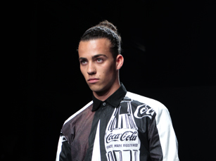
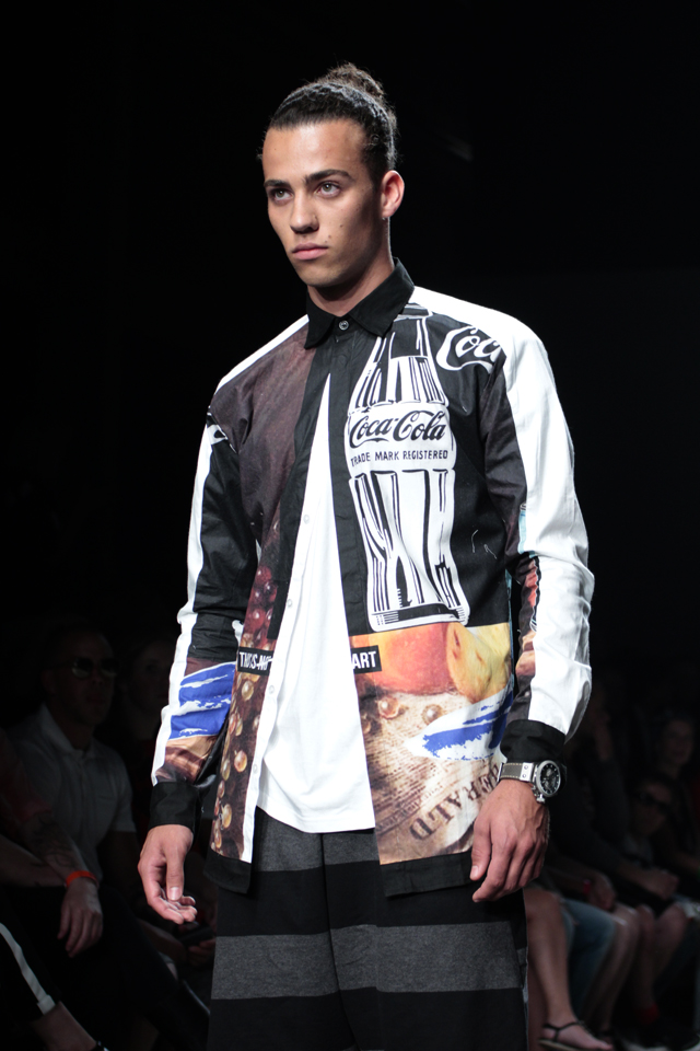
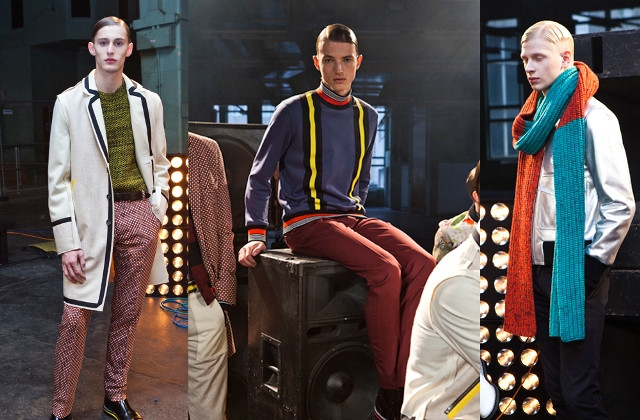
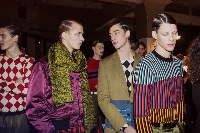
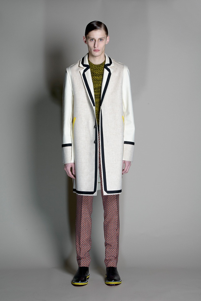
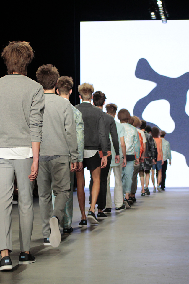
On day three of Amsterdam fashion week BDMOTP had the pleasure of seeing the Mevan Kaluarachchi 2014 menswear summer “Wardrobe” collection, wardrobe being the name of Mevan’s prior collections ever since 2008 which often are seasonless. But not this one.

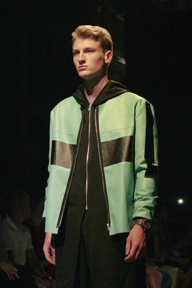
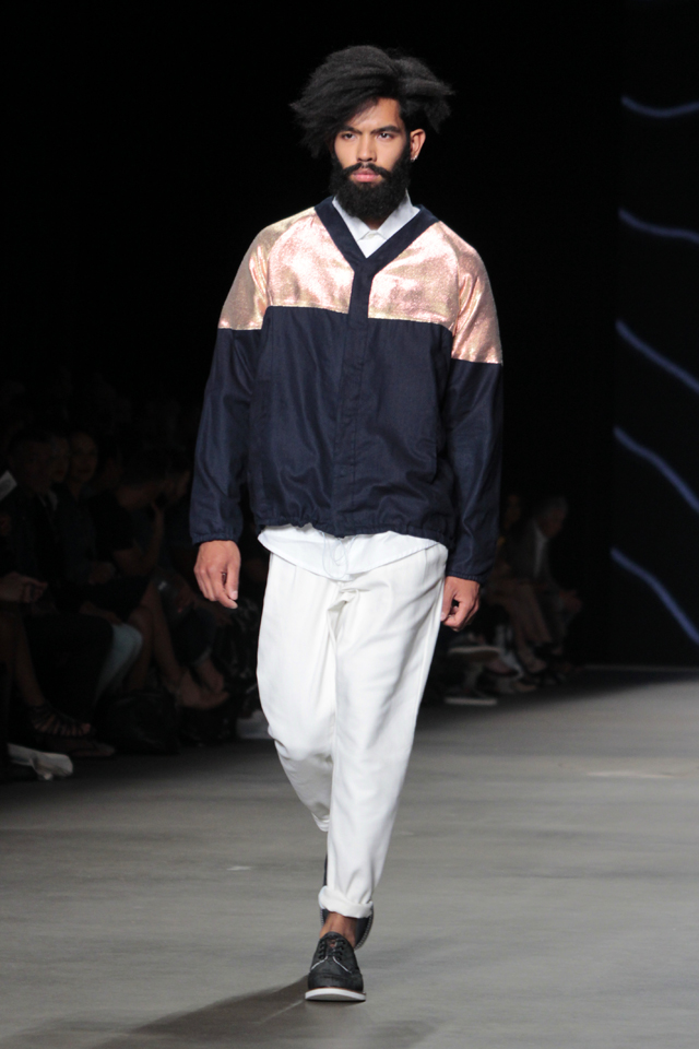
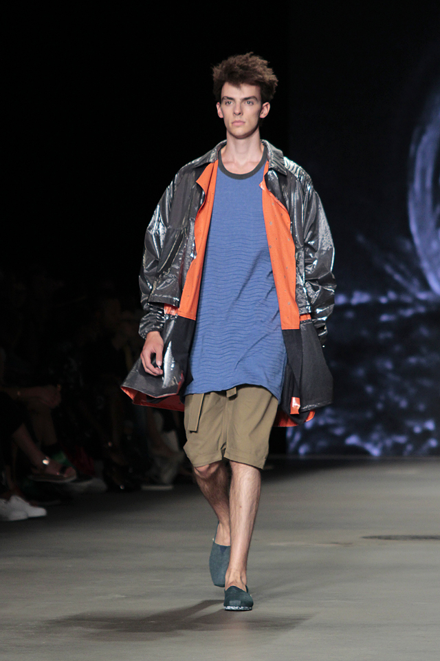
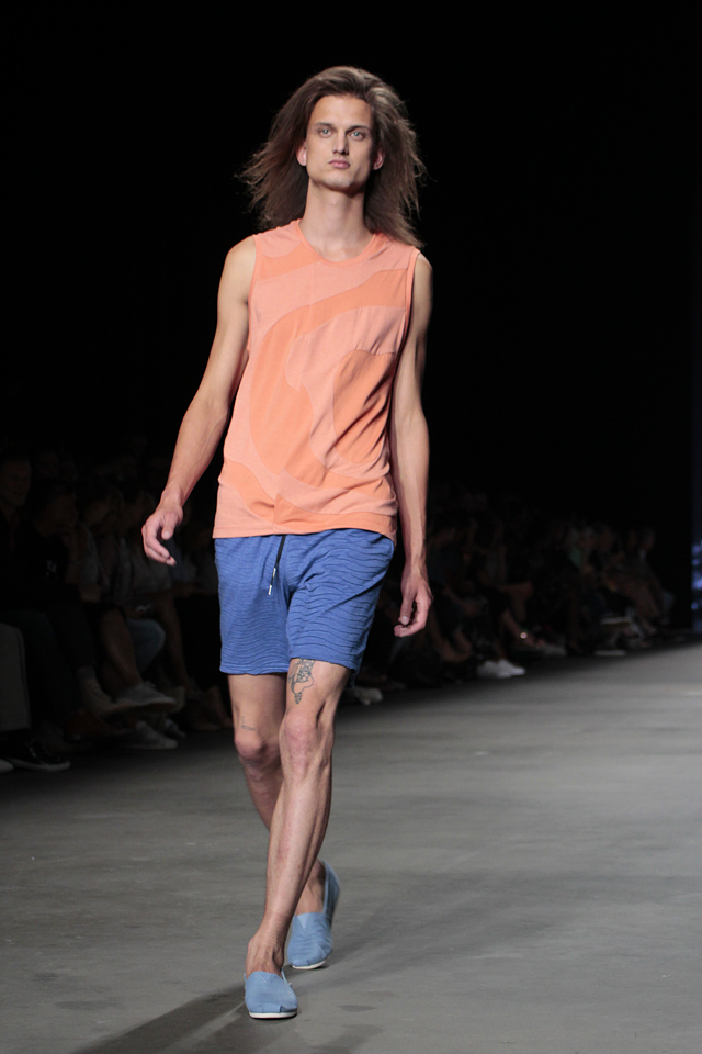
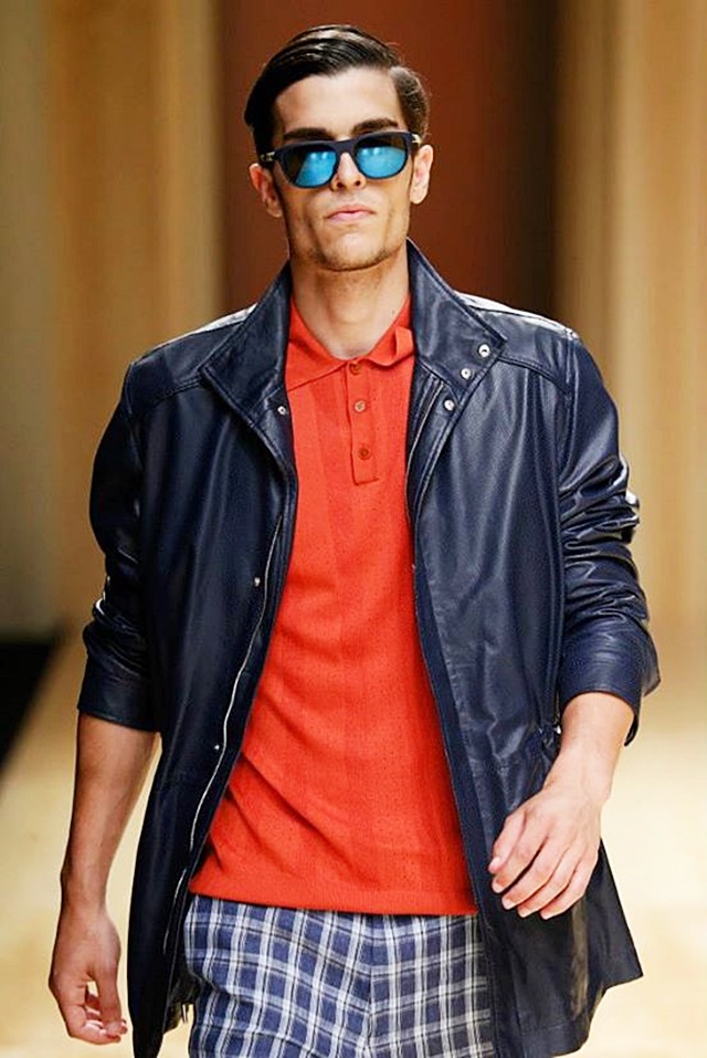
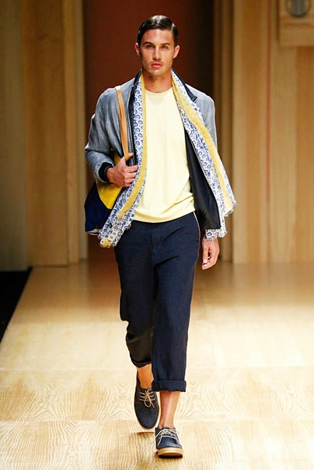
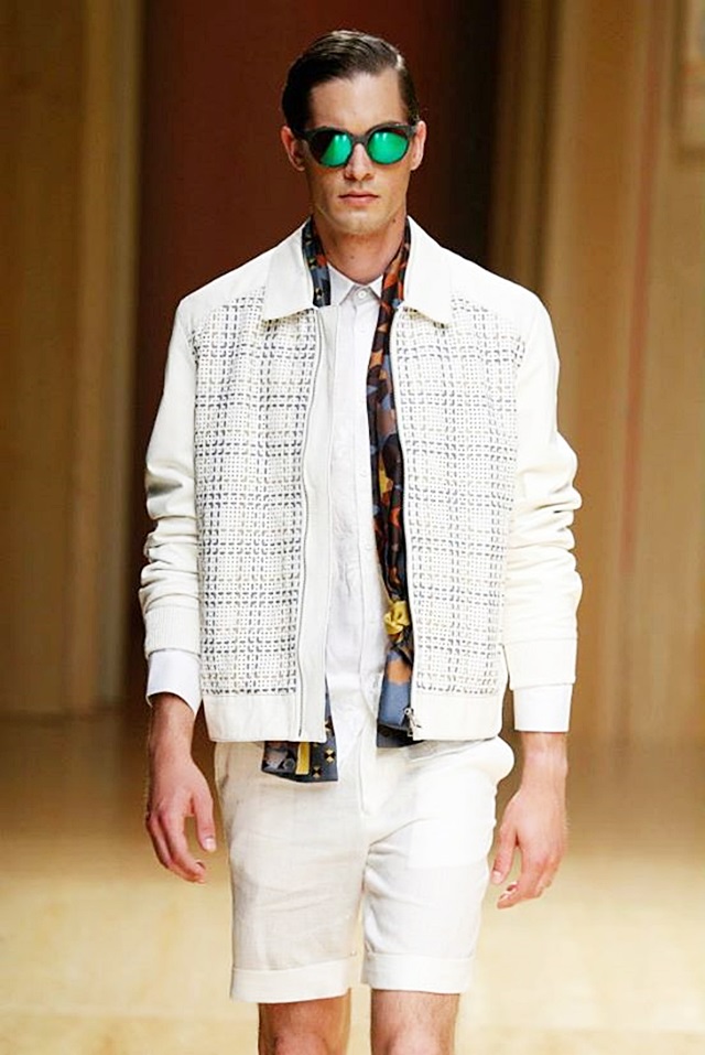
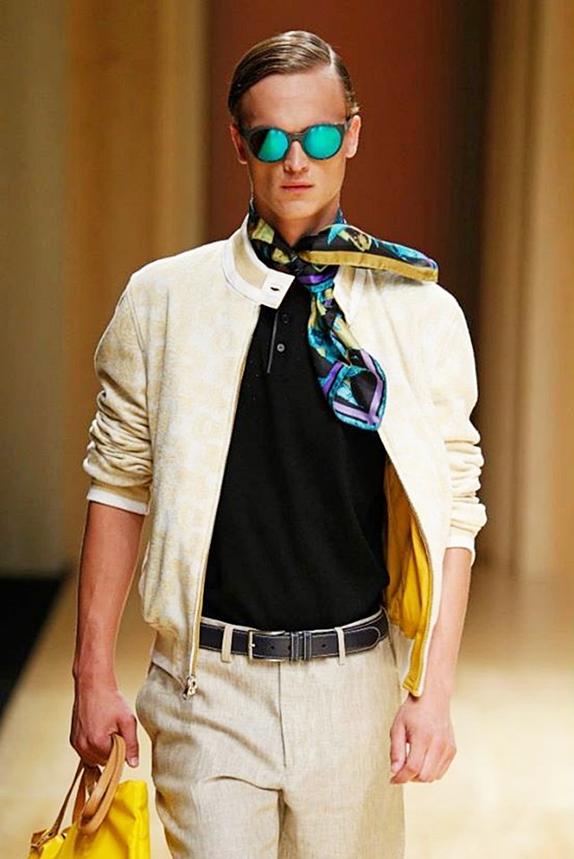
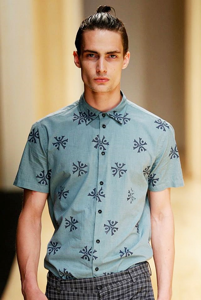
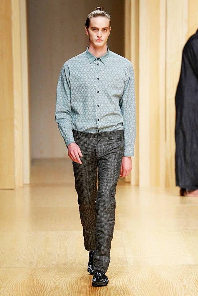
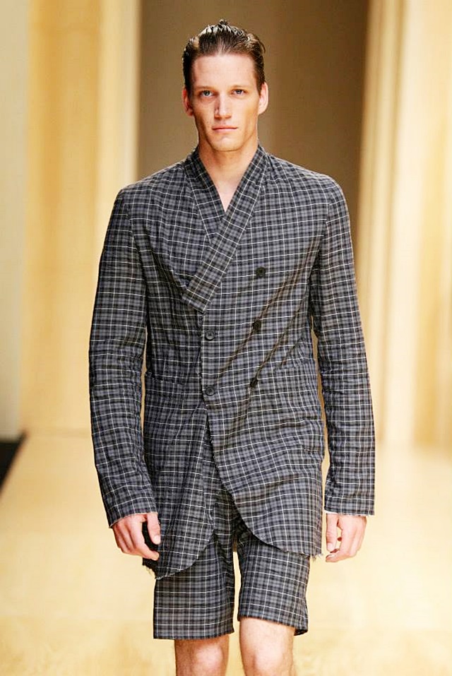
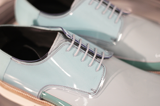
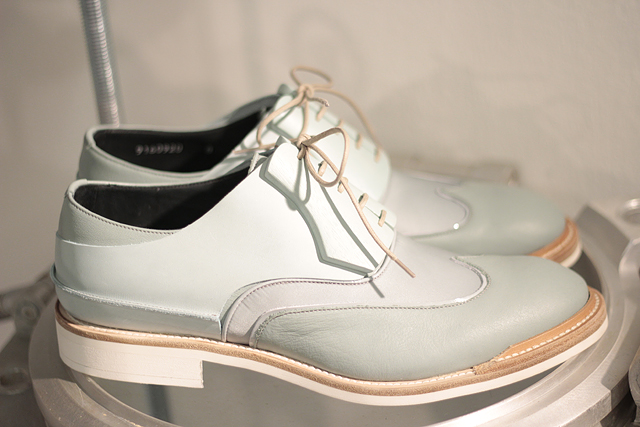
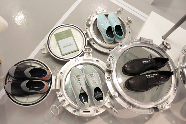
A typically bright summer collection in light and gentle colors, simple and straightforward designs and concepts, a refreshing and lightly colorful look and style, with the added twist that some of the materials used have a multi-colored layered liquid shine to it, which often can be the case when designers are inspired by materials coming from India or Sri Lanka. Think Bollywood but with colors much lighter and more refined and subtle and think very light clothes for the summer.

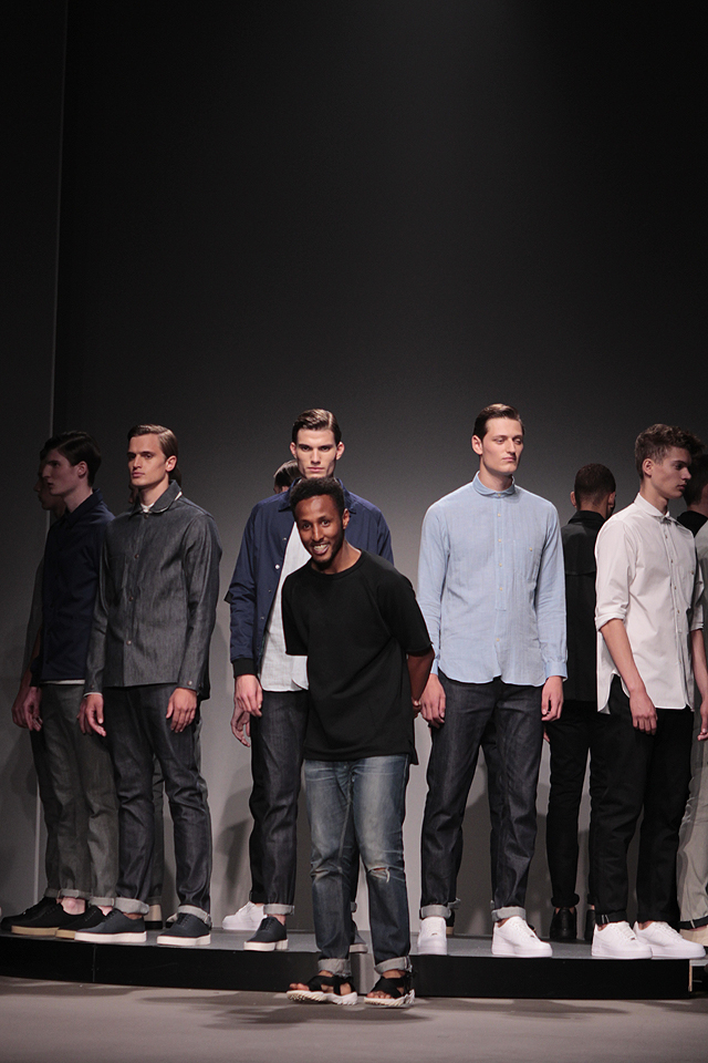
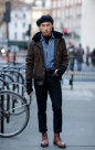
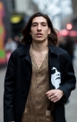
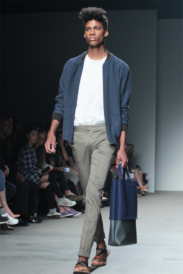
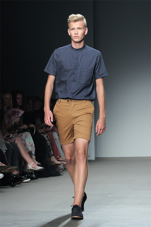
Think again, like we noticed in the other collections over the past couple of days (espcially Non by Kim) at Amsterdam fashion week, of men in shoes but without socks. Shorts. Light jackets. T-shirts. Summer shirts. Sandals. But all laced with light colors so as to fit into the summer season when nature reaches for the sun.

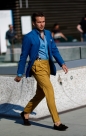
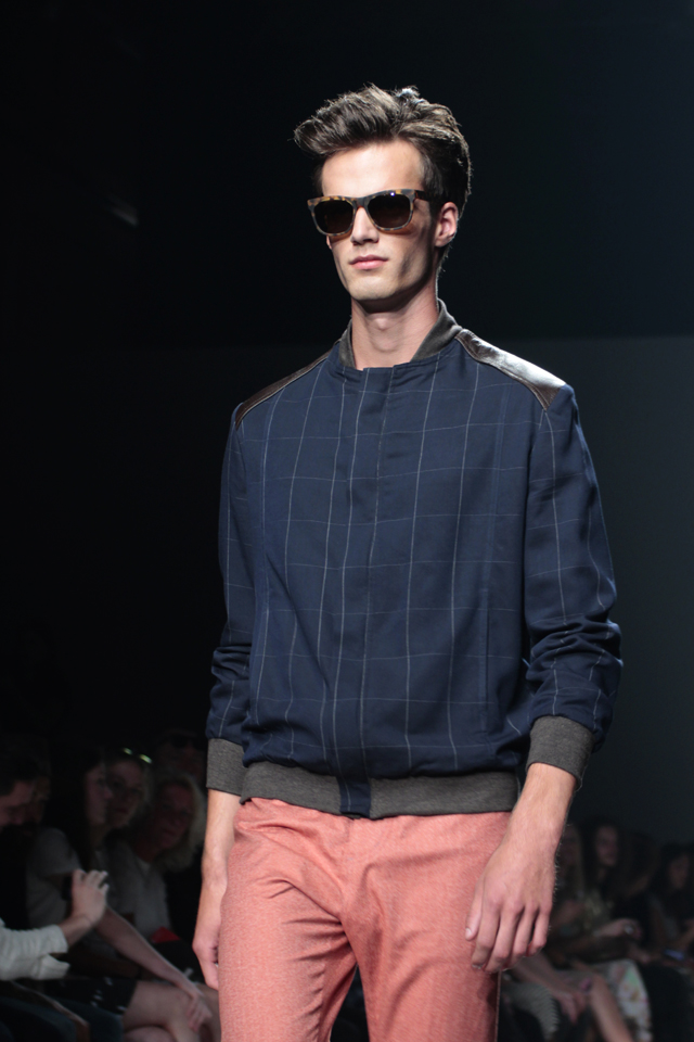
Thus Mevan Kaluarachchi is creating a very seductive “haute gamme” line of quality menswear for summer. Casualness is key and the light colors are important, as is an open and inviting look or style. We spotted traditional summer sunglasses with matching sandals, light jackets over T-shirts, shirts loosely hanging out of light but well fitted trousers or pants.  In look and style Mevan Kaluarachchi was able to create a line for summers past and for summers future – a collection of pleasance which will not change over time – not on those summer days when your mind is free of care and free of worry and when you like to hit the streets in good style going for an easy stroll.

Yet one item stood out in the collection and we would like to give it a special mention. In the same way certain beetles are able to reflect light yet refract two colors at the same time thereby creating two different colors at once, one of the models was wearing a pair of light pants with a blue summer jacket and a white T shirt with sandals, and with the special feature that it was refracting both purple and blue at the same time. It was the star item by a distance on this runway but when you look at the photo of it below, you will not be able to see the double color light refraction although you will be able to spot the pair of trousers. This is one of those things which with the current level of technology available, one is only still able to see and witness in person. And which materials and which method precisely were used to create this gem we do not know but it would certainly make for an interesting future study and post on the topic. Suffice to say that people were awed by its very appearance and that we wondered why only one single item of this magic fabric was on display.

mk17mk11mk08mk03mk14mk15mk05mk10mk12mk06mk01mk13mk07mk02mk16mk09mk04


Posted by Sandro Joo and photos by Paloma Canseco.

The Franzel Amsterdam collections at Amsterdam Fashion Week day two had an industrial and commercial feel to it, and when researching this audacious designer BDMOTP discovered that the reason for an aggressive style statement is that the designer himself originally came from a tough background where it was always important to keep fighting for success–and that this includes the statements men make every day wearing their clothes. Apparently the designer wishes to reach out to men, giving them the ability to become, what he calls, new. We could call it the “new man” collection, in the sense that each man faces a struggle certain in society to make it, from the bottom to the top, and in that only the new man has a chance to succeed.

The looks and sounds on the runway were industrial, commercial, sometimes gothic in its perspective, but with a large dose of art and non-art, street art, classic traditional art, classic art blending in with industrial design, or modern art, pop art, blending in with commercial design. This was aptly phrased by and characterized by a mission and brand statement printed across most of the collection with the slogan: “This is NOT art.”, the word “NOT” being crossed out to emphasize the ambiguity of the style.

Vermeer’s Girl with the Golden Earring and Van Gogh’s landscape art in all its colors blended with industrial and commercial design, and set on and against materials ranging from plastic, to latex, cotton, and everything else but wood.  Andy Warholesque repetition of commercial products, in the form of coke bottles, and yes the infamous can of Campbell’s soup, juxtaposed against images of traditional art like the Mona Lisa. A blasphemy of sorts really for those who like tradition, or for those who like pop art.

One definite and notable standout in this marvelously macadam collection made for new, new summers on the streets of cosmopolitan cities around the globe, were the sporty calf-high white socks paired with various not-to-be-missed red basketball sneakers. Now granted that wearing little-red-riding-hood red sneakers in some parts of town may be dangerous fare as immediately all attention is drawn to the man who dares to go in style making such a bold and obnoxious statement in such fiery fashion, but we do have to admit that it still looks ‘bloody’ grand and pretty awesome on the runway–especially when the men go in teams wearing the same baskets, the same colors.

A pretty bold statement indeed but knowing that Franzel Amsterdam aspires and promises to make those men “new” who come from the other side of the tracks or from perhaps a the not-so-easy part of the hood, this may very well be the quickest road to success in life indeed. For the man who dares to stand out in colors in any and all circumstances, he, he will already have won, for the simple reason that he was able TO STRIKE A POSE before his rivals came along.

Franzel Amsterdam:  For the man who dares…

fa03fa01fa08fa07fa02fa06fa04fa05


Posted by Sandro Joo and photos by Paloma Canseco.


“We are Victorious. We are the Young Barren Warriors of Planet X. At your peril, you will have forgotten us, but we hark back to times stretching eons.  Our heads are always held up high so that our gaze is fixed upon infinity, but no you won’t see our eyes as we protect ourselves with special glasses made of lead, which protects us from the tritium radiation found everywhere in our thin planet atmosphere.  Like Riddick, we see in the dark, so we take it for natural that our forms and our fashion must appear alien to you. Dark perhaps. But our mission is not to destroy, but to impress, to flaunt, to walk and to walk on.  We are the walkers, the ones you have forgotten. For man’s journey from boyhood to man is not without scars, and not without moments of peril.  The reason we appear so strange and alien to you, is because this part of manhood has long been forgotten. On your world this old way of life lies still hidden and preserved in what you call the middle ages, or in TV shows like ‘Games of Thrones’.  Hence your fascination.  And in Ridley Scott Sci-Fi movies of course. We are the last refuge of forgotten manhood, our lives are viaticals, in which things will come to pass which cannot be planned or controlled. We are free, not of because who we want to be, or by the petty privileges which authorities can bestow upon us, but by the burden of our fate. Because to become a real man, is the greatest thing there is.  But let us walk on, because the days are short on our planet, two suns are setting, and the night is full of danger.”

Many kudos to Dutch designer Mirte van Wijngaarden at Amsterdam Fashion Week day two who created a collection “We Are Victorious” which can be referenced as fitting for the outcast cast of men in a post – apocalyptic end-of-times kind of movie who are still meandering and roaming the planet in search of something which they know must exist but of which they have forgotten the meaning despite their strong reliance upon all their inner resources – is it love perhaps?

This collection thus definitely tells a powerful story and has a strong message but, mind you, what is impressive the most, is that besides the impressive looks and style created, that the materials used are actually backing up and embedding this Mad Max movie scene. Who would actually think of using lead as a material in fashion? And this in combination with leathers, cottons, linen, latex (hmm), and get this, many a portion of very useful flax.

Flax is a very useful type of material as we all know (think potatoes) and is known as Linum Usitatissimum in Latin which would probable translate as ‘Linen to be used’ and yes, one may very well imagine Riddick or some other doleful warrior in desperate need of resources resort to the use of flax for, aye, the very basic need of clothing.

Where is that bag of potatoes when you most need it, when, all things being equal and all things well considered you would rather prefer to go hungry rather than not to be clothed properly?  A hipsters nightmare.  A warriors dream.  Instructions:  Just cut that flax in pieces and style yourself. Aye, use some latex you find down the road, some rubber perhaps, and if you are lucky some old leather from animals long dead and gone.  And then you get up and put on your protecive eyewear – lead. No need to be smug. Just be calm and very collected, so you can keep on walking…

mvw04mvw07mvw01mvw03mvw05mvw06mvw02mvw08


Posted by Sandro Joo and photos by Paloma Canseco.

NK01

It’s the second runway show for men at Amsterdam fashion week and we are looking at NON (non-seasonal) by Kim, as in Kim Bakker, a Dutch designer strongly influenced by Indian and Persian materials and colors.  The light colors come out beautifully and strikingly and the layering of fabrics make for a light and liquid look.  It’s perfect for summer dreams.

NK02

This collection is called the Panta Rhei menswear label and there is a light and summary ambiance and look to the style which seems to perfectly fit the warm days and summer clouds in Amsterdam this fashion week.

NK03

The no-men-wear-socks-please look was again full on display, as was the frizzled and frazzled hairdo-look which, yes, seems perfect for the beach, for hiking in the mountains, or, aye, for riding a bike along an Amsterdam canal in summer.

NK04

Kim clearly is a style and trend setter with this accessible and open and playfully shiny and lightly colored collection, which very well may do just as well on Ipanema beach, in Miami, San Francisco, or Barcelona, as it would in Amsterdam for summer – but no, not in Detroit.

NK05

Posted by Sandro Joo and photos by Paloma Canseco.

OH01

Amsterdam fashion week opened up for men’s collections yesterday (Thursday July 10) at the Transformatorhuis (the short runway) with young Dutch designer Olaf Hussein. This was his first runway show ever and the event coincided with  the release of the new Olaf Hussein website.

OH02

The colors Olaf is using range from the 4th spectrum (anything between black and white) to different shades and hues of blue, which makes for a definitive denim look and for practical street-style type associations.  If this were middle class America somewhere in Detroit, baseball caps and hoodies would be part of the collection (indeed spotted one hoodie but not so visible) and the pants would have been worn lower on the hips for sure. But it gives you this Dutch style practical street look, casual but NOT worn/worn-out, but definitely loose and free and meant to wear on the streets.

OH03

Trendy sneakers in the same colors as described above – without socks of course – are the norm in the collection, and casualness here in Amsterdam is worn, well, casually, freely and without any pretension of who you are or who you like to be. And this is decidedly refreshing! Because indeed, why would casual wear denim street style have to be a fashion mission statement: Keep it simple, and keep it free and casual – this collection is  meant to make you feel comfortable, yet nicely dressed while you walk on the streets of Amsterdam.

OH04

Thus it was the perfect kick-off for Amsterdam fashion week for the men’s collections. A brand new designer introducing a casual street denim style collection of what one would represent the streets of Amsterdam, practical in its conceptions, yet ready – to – wear, ready to roll it all out for all the guys and boys who like to be comfortable but who are not afraid of the streets, hop on the bus, go down in the metro, skate on the sidewalk, ride a bike, cross the street, or kick that stone.

OH05

Ladies and gentlemen, BDMOTP is proud to introduce to you: Olaf Hussein !

Posted by Sandro Joo and photos by Paloma Canseco from Amsterdam Fashion Week.

Torras is a Spanish brand that dates back to 1951, and is best known for combining knit and leatherwear. The SS15 collection is entitled “Avant-Garde” inspired by Pablo Picasso, Andy Warhol and Gustav Klimt.

We can see some geometric and linear silhouettes (Picasso), bright and bold looks (Warhol) and patterned floral prints (Klint) present within the collection, showing us the roots of the art inspiration. Trending sunglasses enhanced the already vibrant looks.

The line was chic, light and airy, perfect for spring. The jackets were extremely strong, and the tailoring impeccable. He used a little bit of everything in his collection, yet it still seemed cohesive and compatible, despite the mix of plaids, patterns, solids, florals, leather etc. This is not the last time we will hear from Torras!

BDMOTP: Every single jacket!

torras-6torras-9torras-4torras-7torras-2torras-5torras-1torras-8torras-3


Posted by Lori Zaino and photos from the official Barcelona 080 Facebook page.

Josep Abril is a Catalan designer based in Barcelona. He not only makes his collections every season for a trendy and tranquil man, but he also creates the costumes for shows, theater and opera and gives classes and workshops at different Design Schools around Spain. He will even do bespoke tailoring for you! A man of many talents, that Josep Abril.

He usually shows his collections in Barcelona at the up-and-coming, slowly growing in popularity Fashion Week, called Barcelona 080 Fashion. The Abril signature looks involves sweaters–even for spring–usually featuring some kind of uneven or asymmetrical line. The SS15 collection “Reflections” was no different. Featuring several sweater styles, tuxedo long blazer jackets and an abundance of patterns, the line was preppy yet trendy. The sweaters looked soft and lush and light enough to be worn during spring. The sweaters are basic (meaning you could really wear them with just about anything–dressy or casual) but with a significant design aesthetic detail that makes it just a little different–just unique enough to be special and set the brand apart, like an interesting cut at the neckline or of-centered buttons.

Abril incorporated plaid into the spring line by using it on lighter looks, like shorts. Long tunics and socks with sandals also dominated the runway. To finalize things, Jon Kortajena, famous Spanish model, sported many of the looks along the runway.

BDMOTP favorite: Grey sweater with side, off-centered buttons

ja3ja2ja6ja5ja7ja4ja1


Posted by Lori Zaino and images from the Barcelona0 80 Facebook page.

Saunders11

Image credit: Jonathan Saunders Facebook page

The rue de Lappe in Paris is very colorful and vibrant dirty old cobblestone street in the Bastille quarters near the Boulevard St Anthoine and therefore it was no surprise during this Paris fashion week to find hidden in the old alley’s darker interiors a showroom featuring the Scottish textile print master of the colors of the rainbow:  The marvellous collections of Jonathan Saunders.

Usually well featured in New York and London it was thus nice to be able to see the Jonathan Saunders AW14 collection in Paris during fashion week where normally you would only be able to find a product outlet for the grand brand at Printemps Haussman.

Saunders22

Image Credit: Filippo Fior

Jonathan Saunders is well known for architectural style (called clean-form) colors printed on different textiles and indeed this the coming fall winter collection was more colorful than one would dare to imagine or hope in Paris where in winter almost everyone is only dressed in black or grey, or maybe brown. This type of collection would certainly perk up Parisian streets in winter should men only for once dare to wear more colors than women and buy Jonathan Saunders in addition to their collection of socks and underwear by Paul Smith.

Saunders33

One could perhaps imagine the dark experiences of the créateur from the misty Scottish highlands turned around into blazing and various colors on the various ends of the spectrum so as to brighten short days – all produced and meted out in patterned and engineered pieces of prints on textile, so as to give form and content and meaning to gloomy days. The perfect measure for a dark and forboding winter to come if you want to brighten things up.

Saunders44

For winter and fall 2014, thus, Jonathan Saunders brings us far from the Scottish highlands the light fantastic – the Aurora Borealis descending from above in multi-colors – and printed on your coat, your jacket your scarf, your sweater in mutliple checkered patterns, squares, lines, rectangles – and by golly why not – Coco Chanel windows.

Saunders55

Image credit: Filippo Fior

Posted by Sandro Joo.

Discovering new and up-and-coming designers is one of BDMOTP’s favorite activities, and the showrooms at London Collections: Men happens to be a great spot for doing so. Here we began chatting with Alice Walsh, designer of Alice Made This, featuring innovative tie and lapel pins, dress shirt studs and cufflinks.

Reflection, The Alice Made This SS15 collection

Reflection, The Alice Made This SS15 collection

I was immediately intrigued and starting asking questions about the unique and special pieces in front of me (my eyes are naturally drawn to sparkly, shiny objects).

Alice showing some shirt buttons

Alice showing some shirt buttons

Alice and her business partner (and husband, perhaps? Such lovely people!) were so interesting to talk with and in doing so, you can really feel the positive energy and passion for what they do. So what is it, exactly, that they do and why is it so unique?

AW05

AW03

Alice Made This is a company dedicated to creating unique pieces by focusing on their manufacturing. Now, at first this sounds a bit confusing, but let me explain. They create each group of items in a specific way for their SS15 Collection, Reflection:

The first group, Precision Turned Metal, is created with a process done in the engineering and aerospace industries using solid steel and brass.

The Precious Metal Electroplating uses techniques from nanotechnology, with materials like gold, rhodium, silver and copper.

The Ropework designs are marine inspired and hand woven by British rope makers in East Anglia.

The Investment Casting uses a metal forming process that dates back to 5000 years ago, also used to produce things like gears and turbine place casts bronze with silver and rose gold finishes.

Some of the pieces made  with the Investment Casting process.

Some of the pieces made with the Investment Casting process.

And even better news–every single piece is made right there in Britain. In a land where just about everything is “Made in China” this was like music to my ears. These original, classy pieces are reminiscent of a time where things were truly “manufactured”…fleeting thoughts of smokestacks and the industrial revolution flood my mind… so very, very British. I am especially fond of the Rose Gold pieces in the line. Rose Gold is so “in” right now, and I love how it has that antique, vintage feel to it. These pieces are quaint and special, perfect for a dapper man searching for just the right accessory.

AW04

Posted by Lori Zaino and photos by Paloma Canseco.

Seeing Diego Vanassibara at the London Collections: Men showrooms is always one of the highlights of our time in London. Diego is a footwear designer who creatives stunning shoes for men, using architectural lines and his signature wood panels. For his SS15 collection, Diego surprised us by expanding his collection to also include more casual footwear, with sneaker options, which was exciting. Of course, even the casual shoes retain the air of elegance and confidence that all of his shoes do.

Diego Vanassibara and his team are not only incredible innovators, but also lovely to chat with too

Diego Vanassibara and his team are not only incredible innovators, but also lovely to chat with too

This seasons looks also combined colors. My favorite shoe actually had navy, grey and orange on it, three colors I would never imagine I would like together, but the shoe is absolutely fabulous. A baby blue was also used, brightening up everything for spring.

The shoes ranged from formal wear, casual wear and a mix of in between. The collection is classic yet whimsical and most of all, the shoes are of sound design. Vanassibara explains, “Men have the right to dream too”. I bet all men will dream of owning a pair of these once they see the new collection!

dv04dv08dv09dv07dv01dv06dv03dv02dv10dvftdv05


Posted by Lori Zaino and photos by Paloma Canseco.

Page 52 of 81« First...102030...5051525354...607080...Last »