Carven, Le Retour: Paris FW Homme SS16
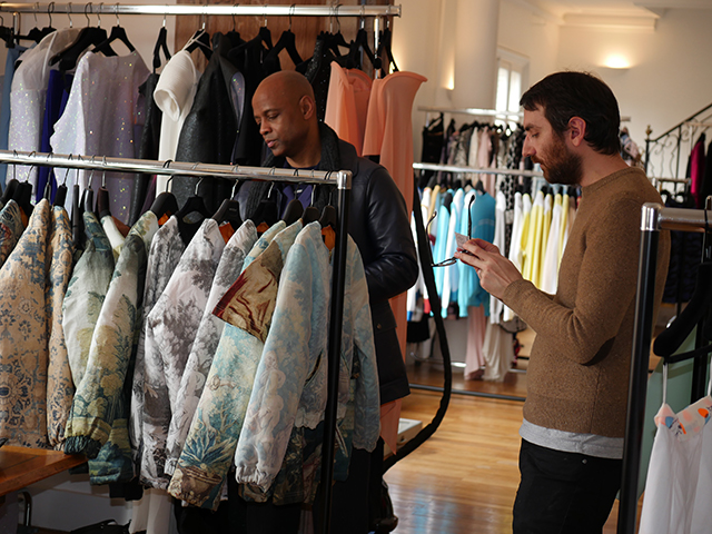
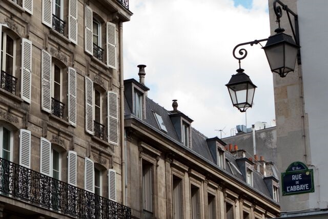
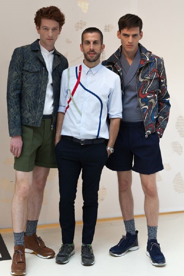
After a January visit (when we saw the beautiful 80’s retro collection) we are back at the Carven showroom in the pittoresque Parisian district of St Germain – des – Prés, on the rue de l’Abbaye, this time on the opening day of Fashion Week SS16 Paris Homme and we are practically the first visitors to walk into the door in the morning in what promises to be a very busy day for everyone, which happens to be our luck for who else is there but Barnabé Hardy in person (see his picture flanked by two models in our slide show below), the designer for Carven pour Homme, who takes five minutes to chat to us about the new collections. La chance!
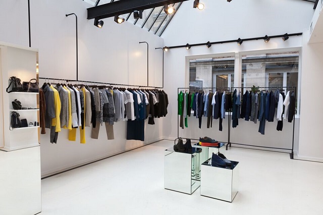
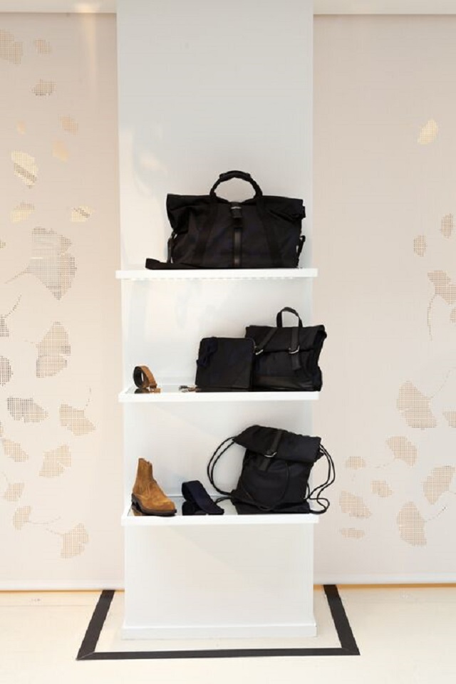
The very bright and stylish showroom of Carven on St Germain
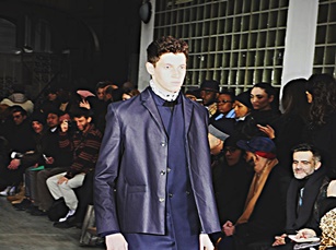
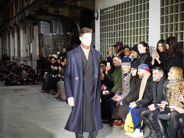
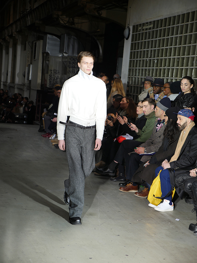
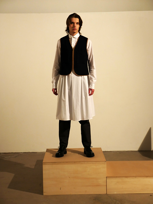
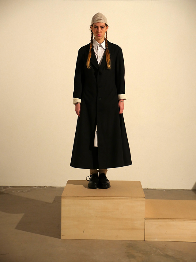
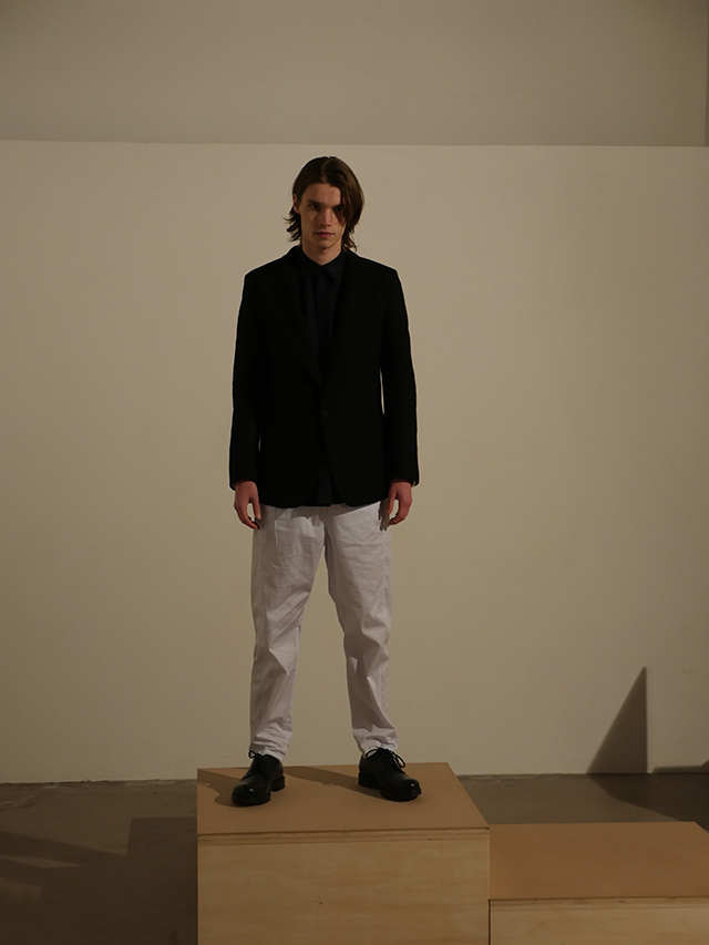
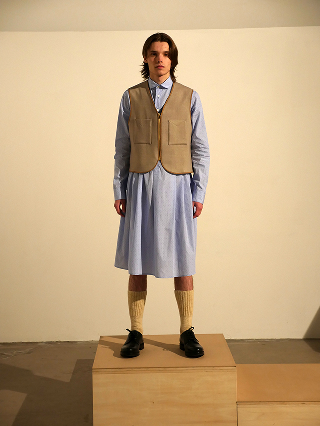
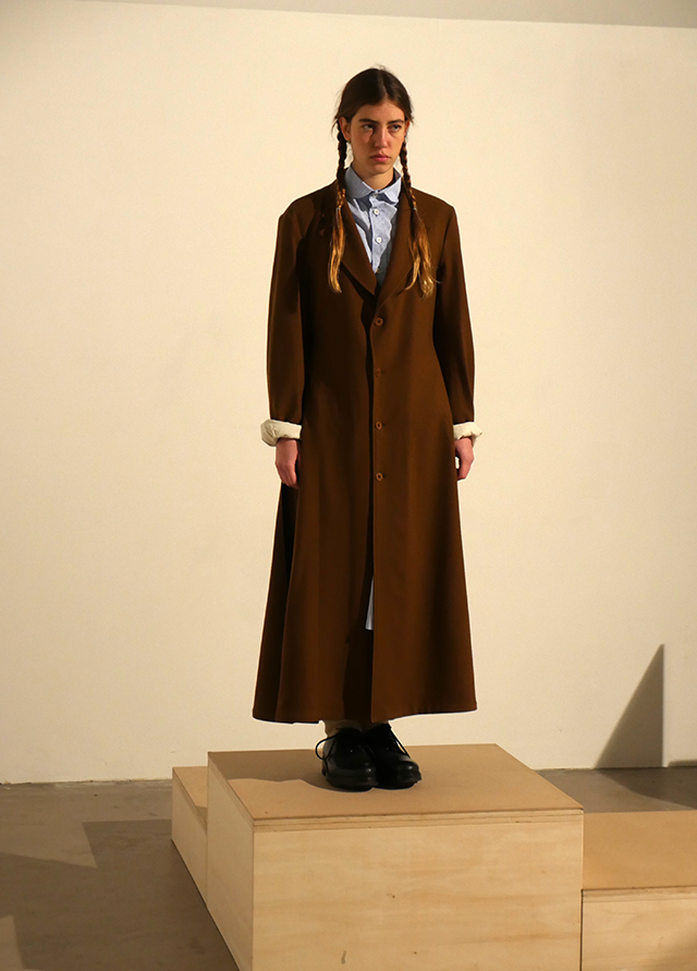
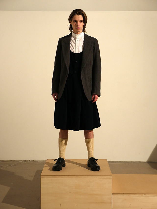
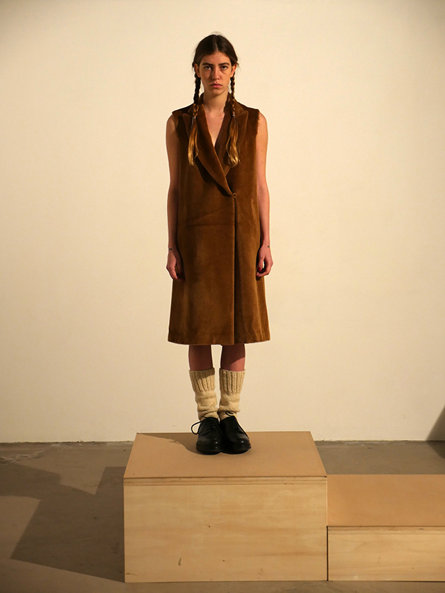
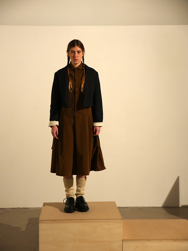
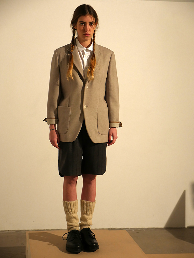
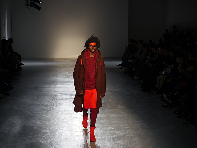
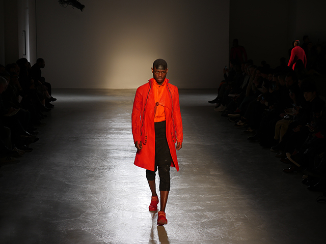
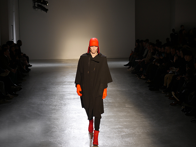
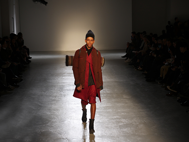
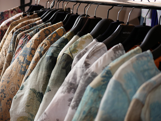
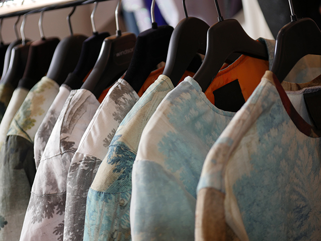
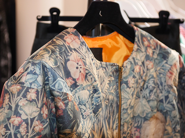
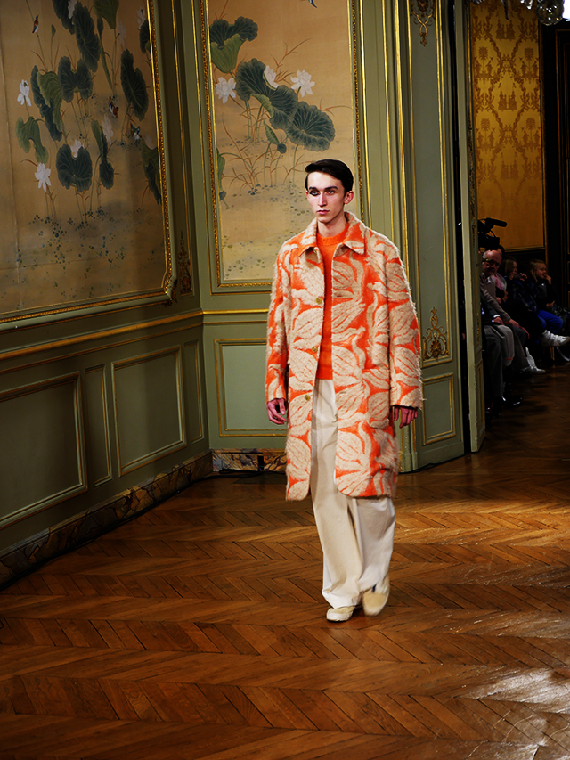
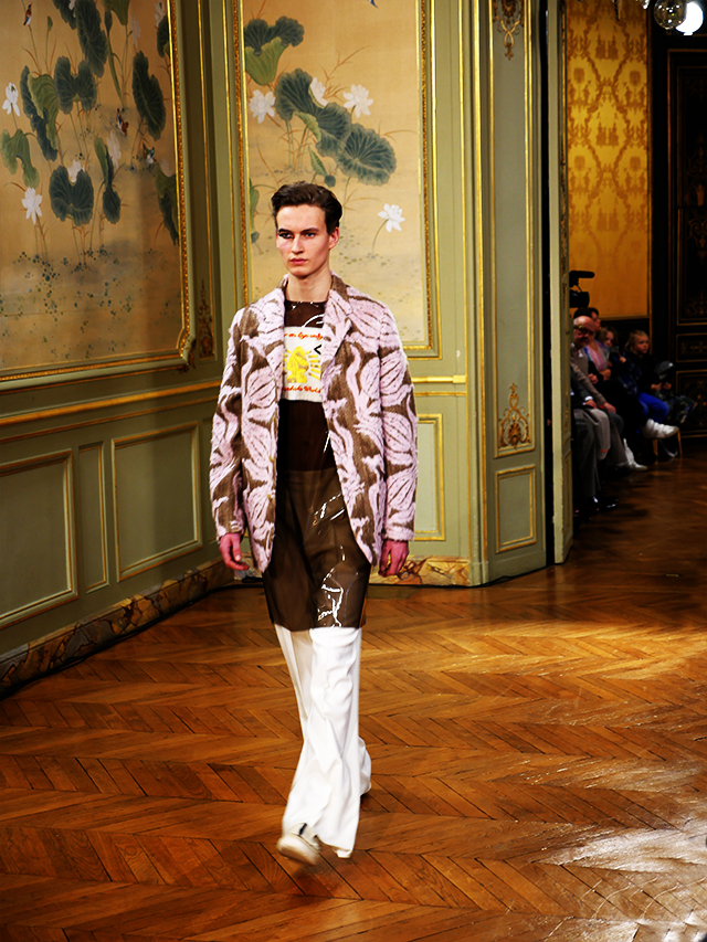
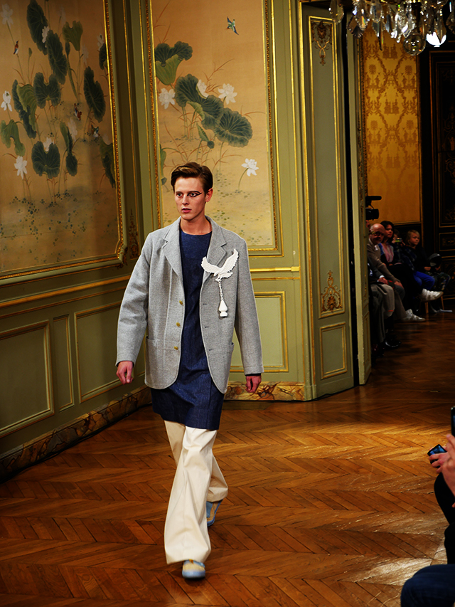
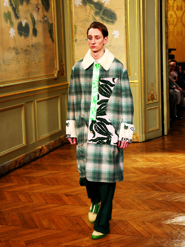
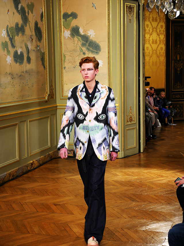
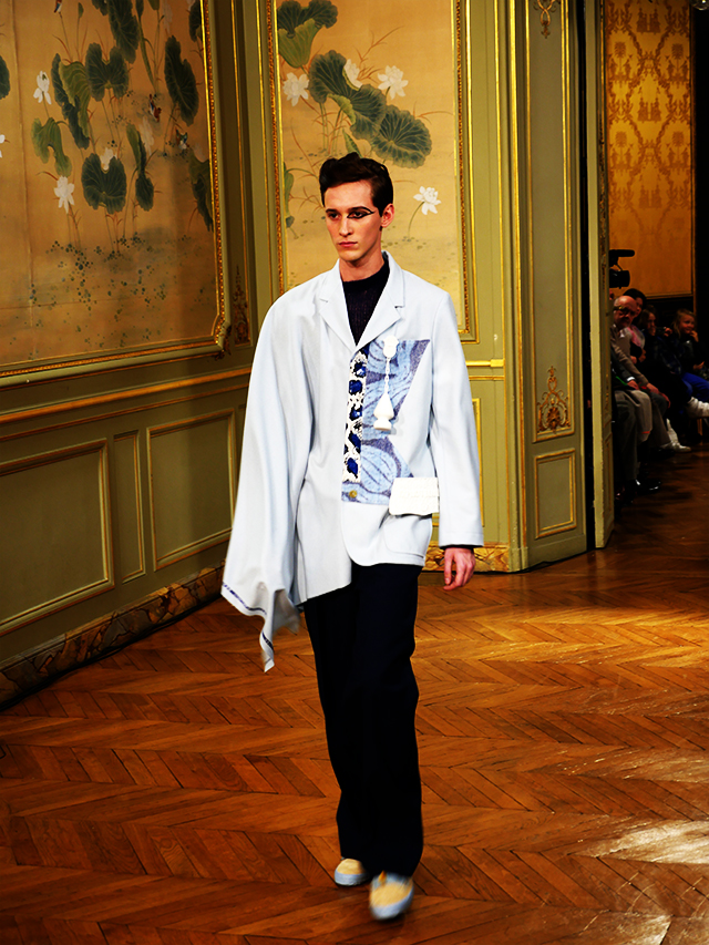
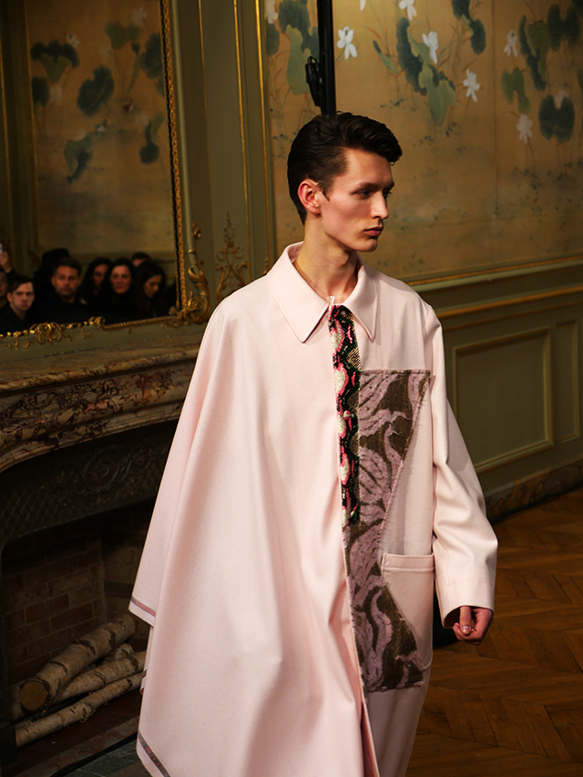
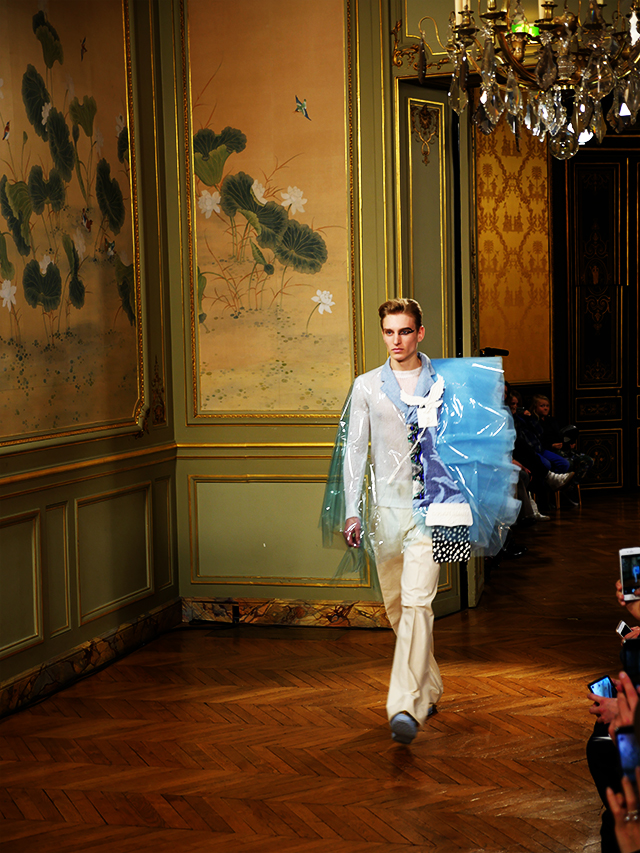
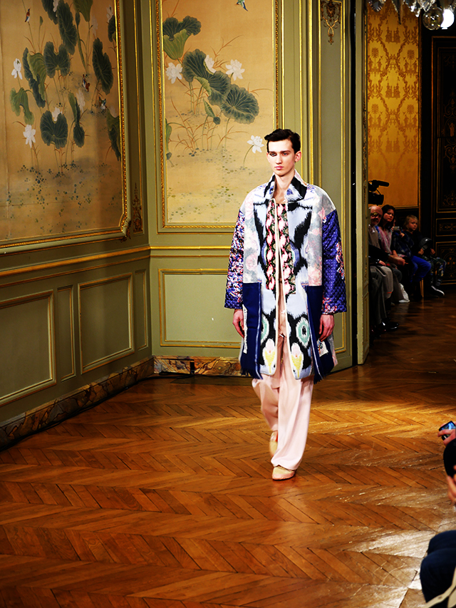
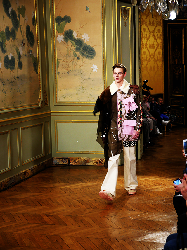
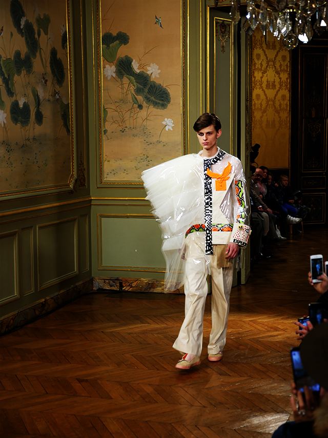
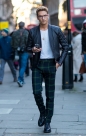
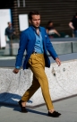
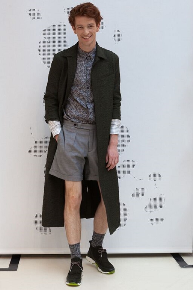
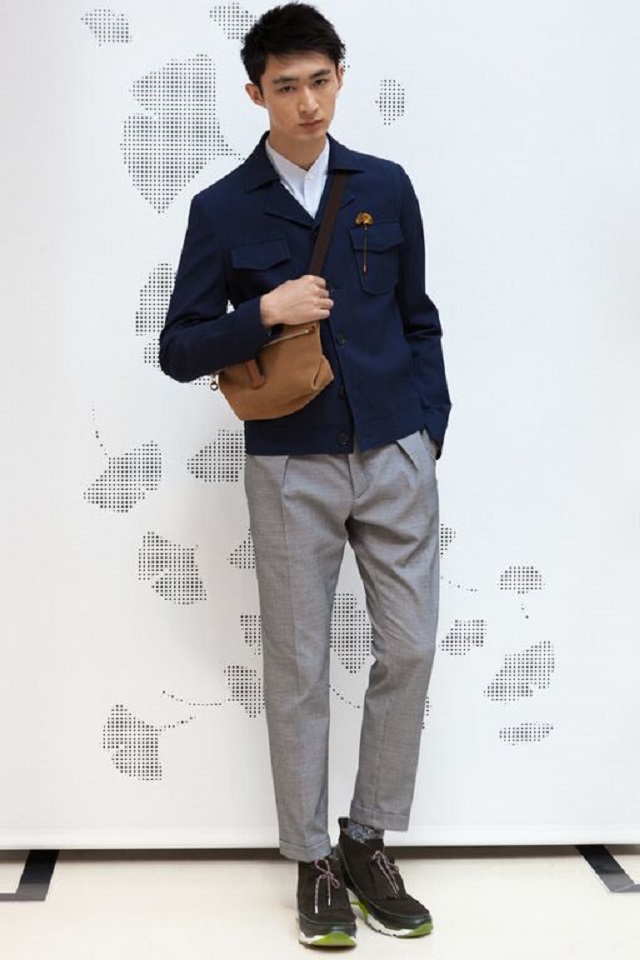
The Carven style is very recognizable for those who aim to know and can be described as both urban (the French ‘urbain’ has a much better sound to it) as well as elegant, which is no small feat at all which you realize when, as a traveling fashion writer for BDMOTP, you have witness only too frequently a lot of trash on the runways under the cloak of the cool-and-important-sounding catch word ‘urban’ (Diesel, G-Star Raw, Phillipp Plein etc. ad nauseam come to mind (even Lagerfeld sometimes is on this end of the spectrum all-be-it in a more luxurious fashion).
So let’s, from now on, distinguish the French URBAIN from the English URBAN in that the former style can actually be elegant, and the latter just as plain vulgar, like as in ripped jeans, colored sneakers, too tight T – shirts, and baseball caps put backwards or sideways – you know the drill. No folks, this stuff from Carven is both Urban and Elegant AT THE SAME TIME. So let’s qualify it as Urbain – Chic, if that linguistic twist would not offend too many Anglo sensibilities.
Ambiance is everything
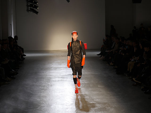
I mean look at those incredible shoes. Are they not the perfect example of urbain-chic?

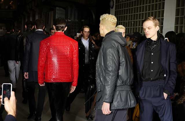
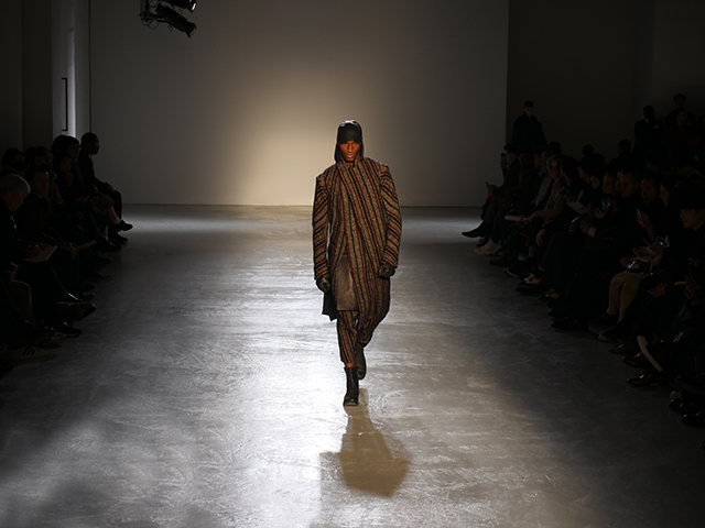
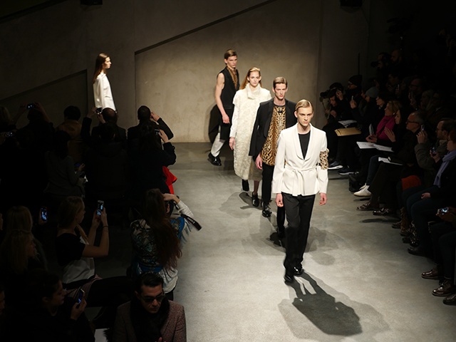
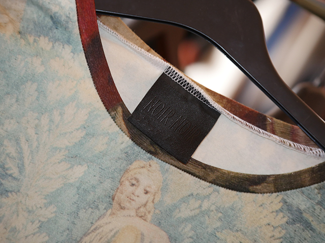
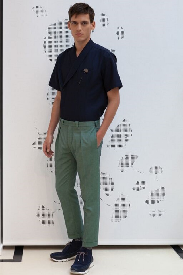
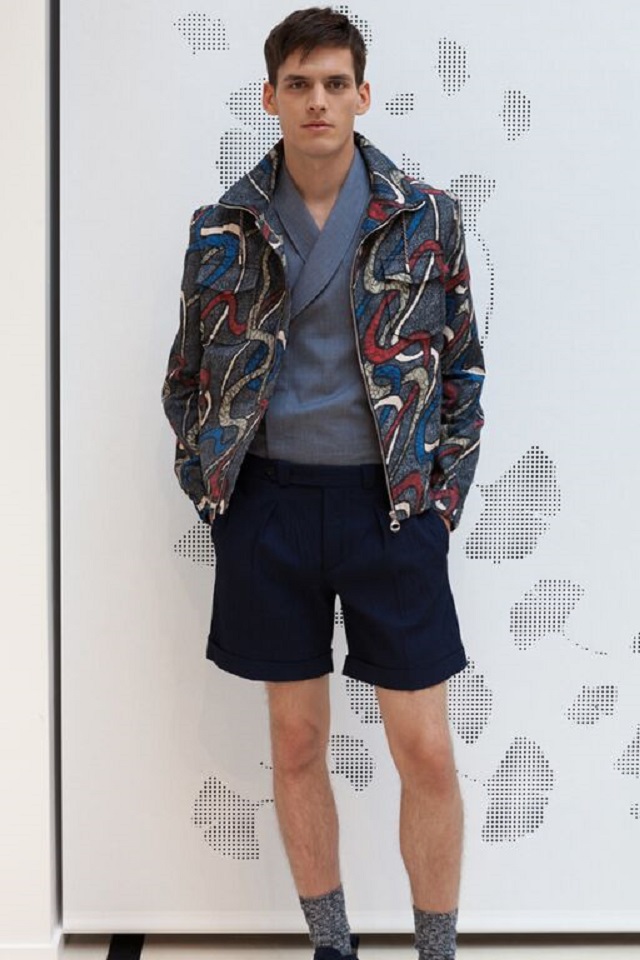
Barnabé explained about the urban concept behind the collections and we asked if there was a retro element in it, but instead we heard that urban patterns can be found both in the materials used (the relièfs) as well in distinguished patterns of blocks, stripes, spirals and other inter-laced motifs. The designer spoke of ‘light’ affecting his choice of colors and in addition to the choice of colors indeed the whole Carven showroom is very light and open, and of small detailed signatures in each item for the new collection (Hermès is good at this too), some of it so small and refined that it could not be captured by the lens of our photographer.

As showrooms go, this is one marvel you should not miss
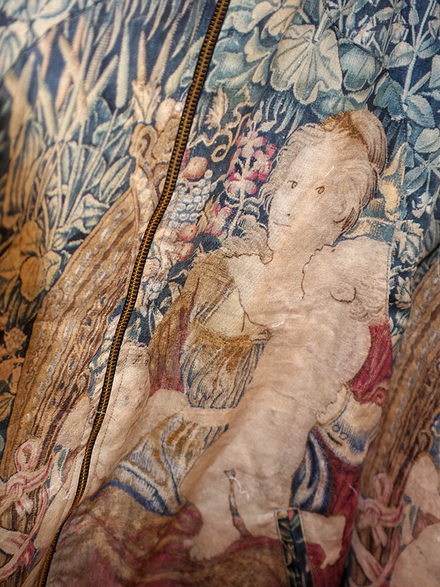
Unfortunately our brief but interesting interview with the designer had to come to an end as the showroom started to seriously crowd with people and our last question was to ask Barnabé about the style of the clever and stylish shirt he was wearing (colored twirls and curls on a white shirt in relièf). Was this a good example of urbain – chic perhaps?
And this is where we had to resort to English and not French. Because the answer was simply ‘swag’, that one ubiquitous word in English fashion language that everybody always wants to use but for lack of ideas nobody knows how or when or why. Well here it was then, the style of the interlaced colorful twirls and curls on the shirt of Barnabé Hardy as the household example of what is ‘swag’ defined. And it also defines Carven. For Carven, in addition to urbain – chic, has some real serious swag.
I mean look at those shoes.

Post by Sandro and photos by Mous.