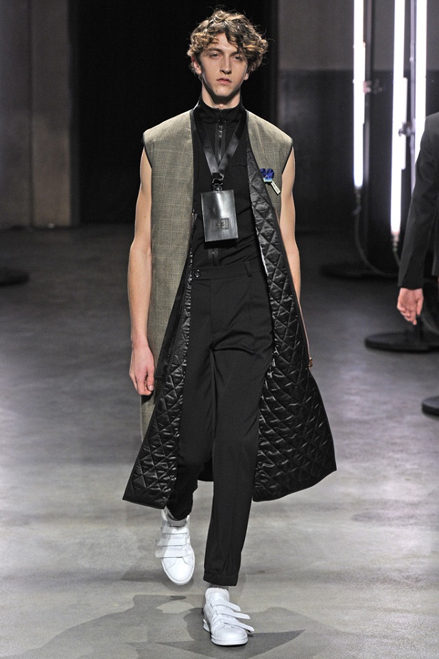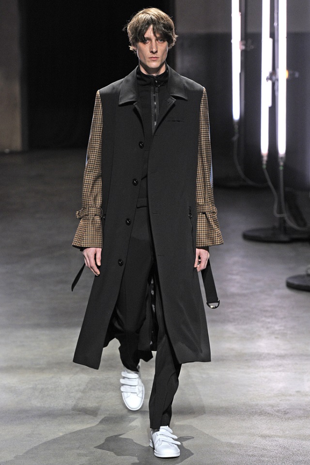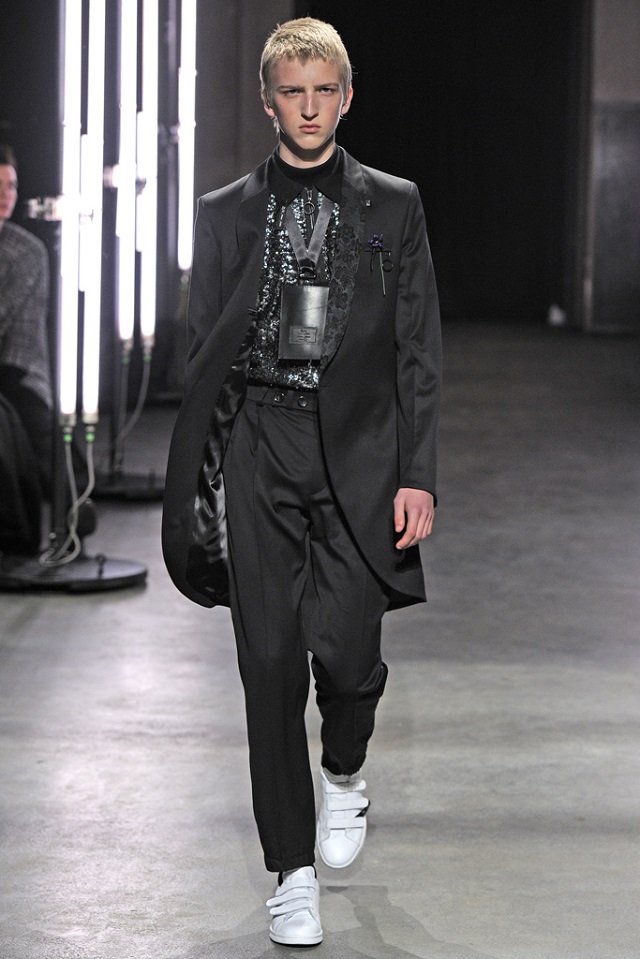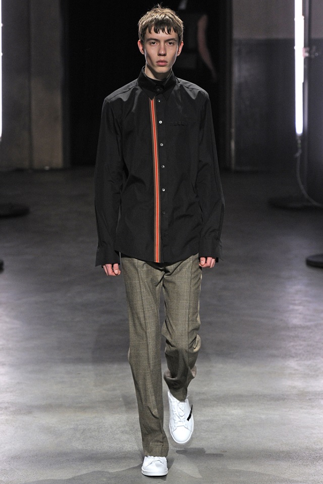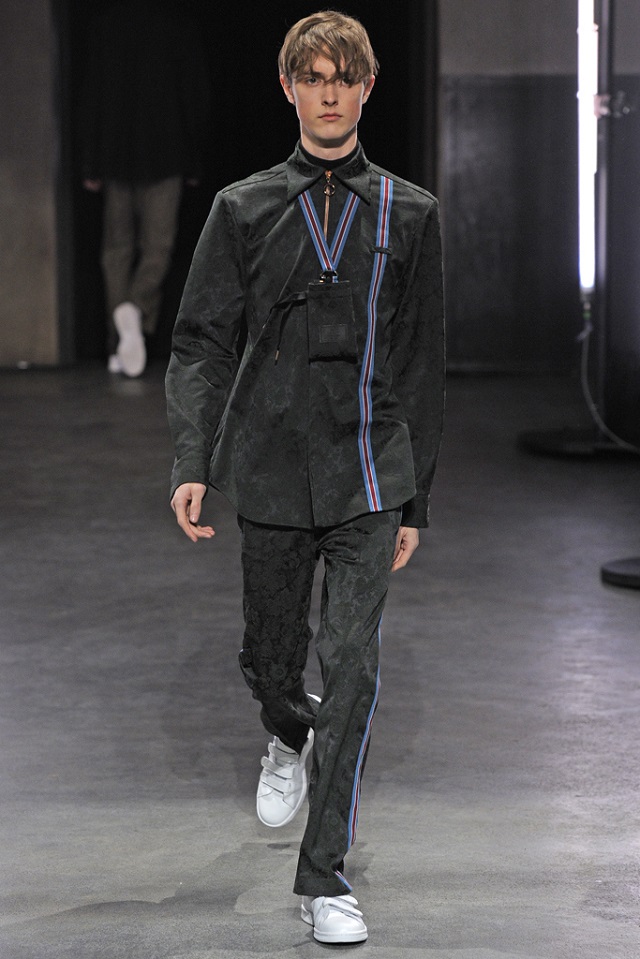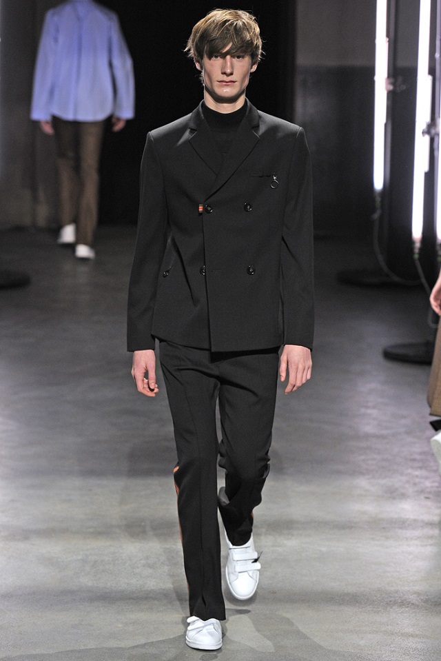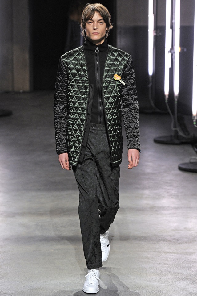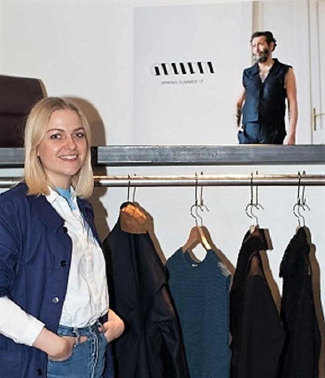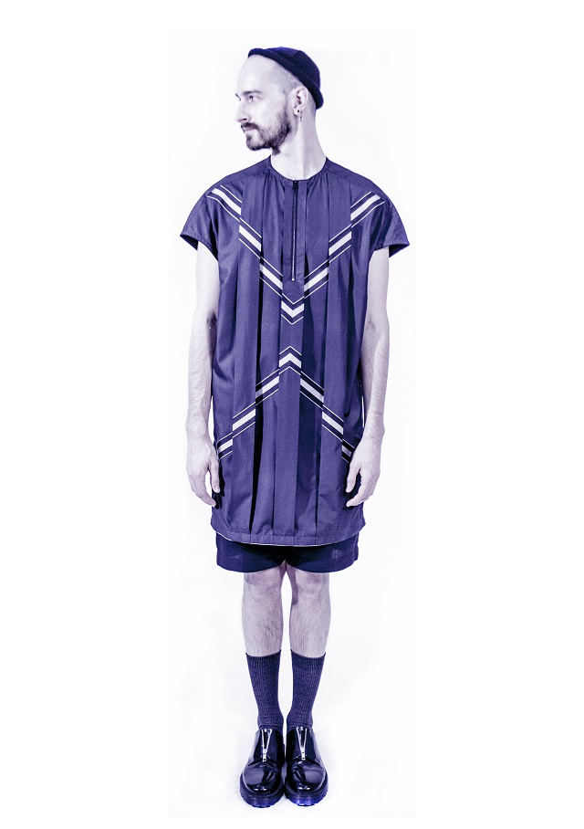
ACNE Studios Caption

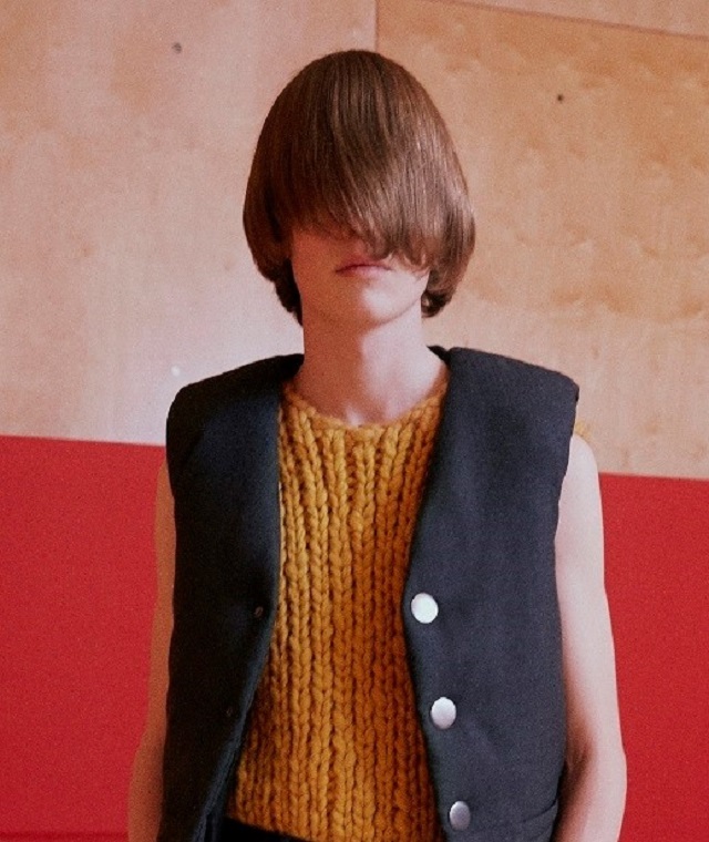
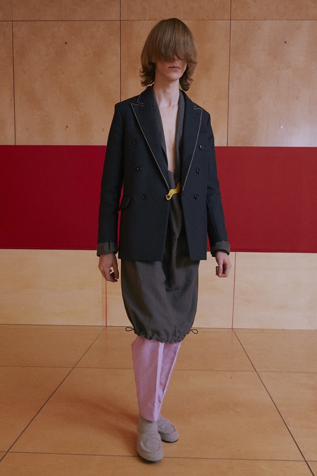
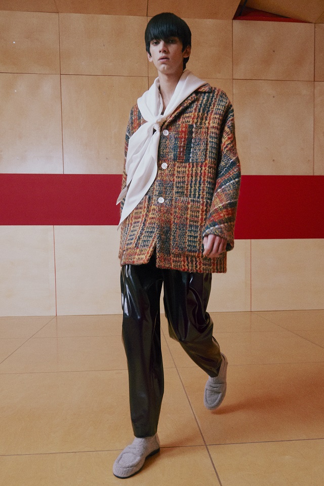
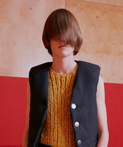
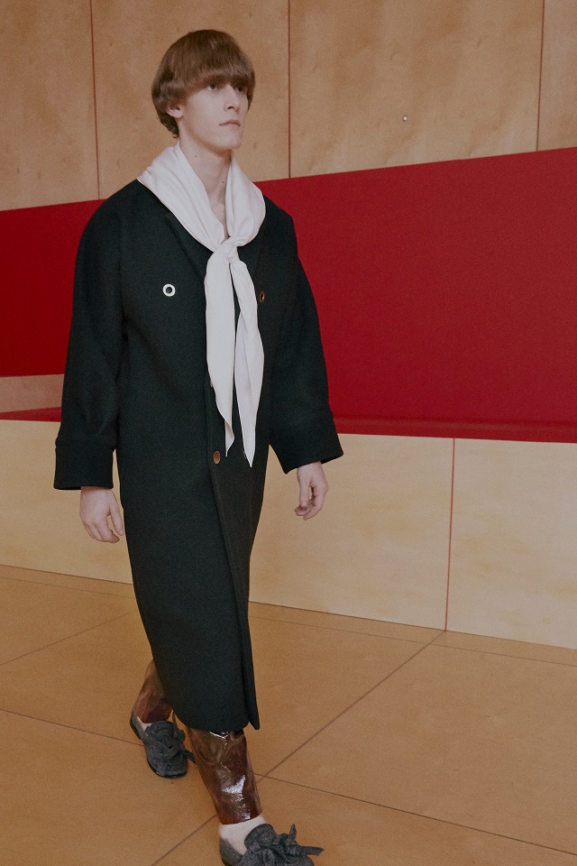
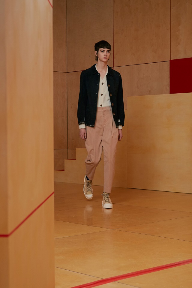
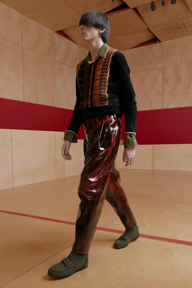
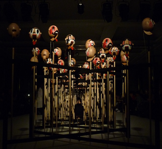
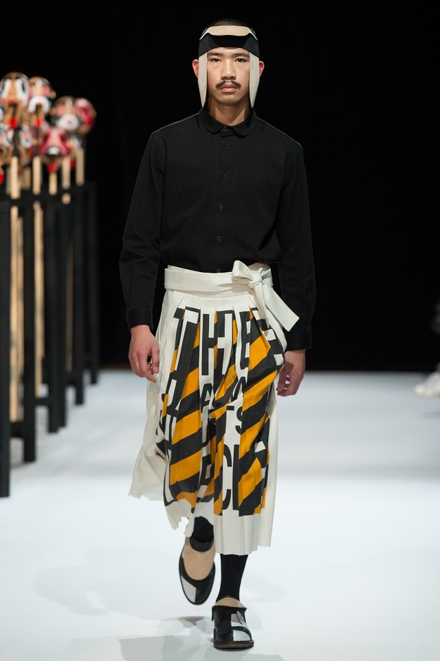
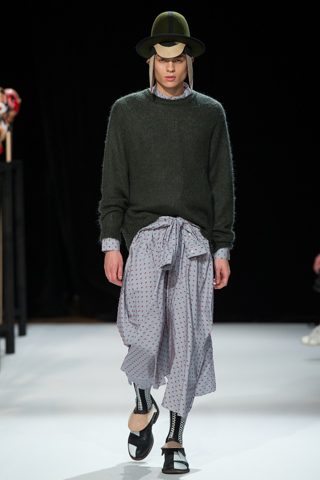
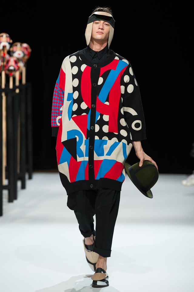
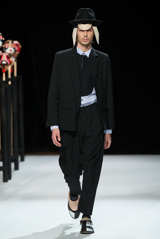
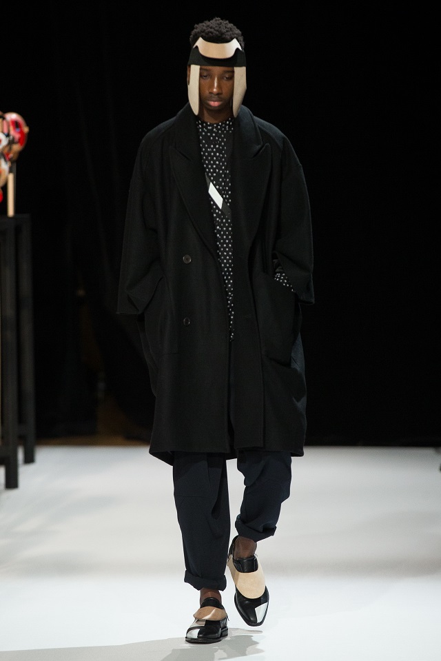
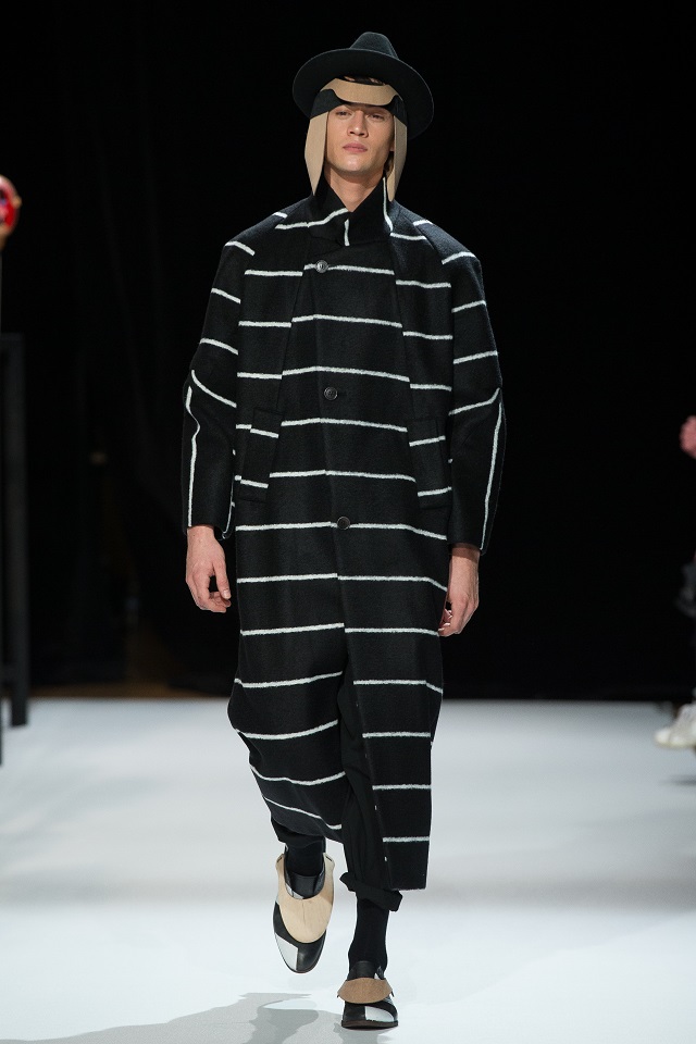
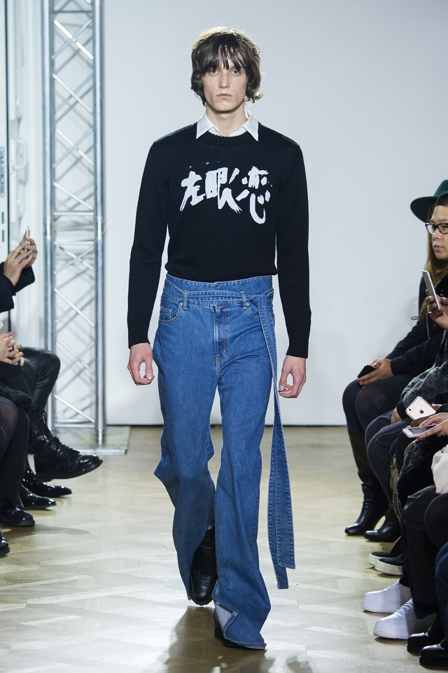
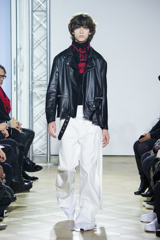
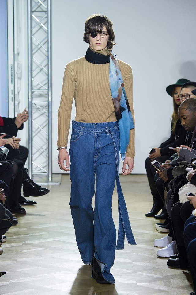
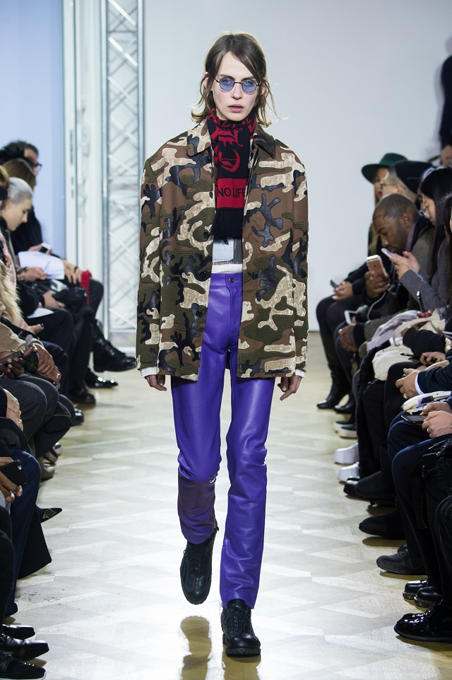
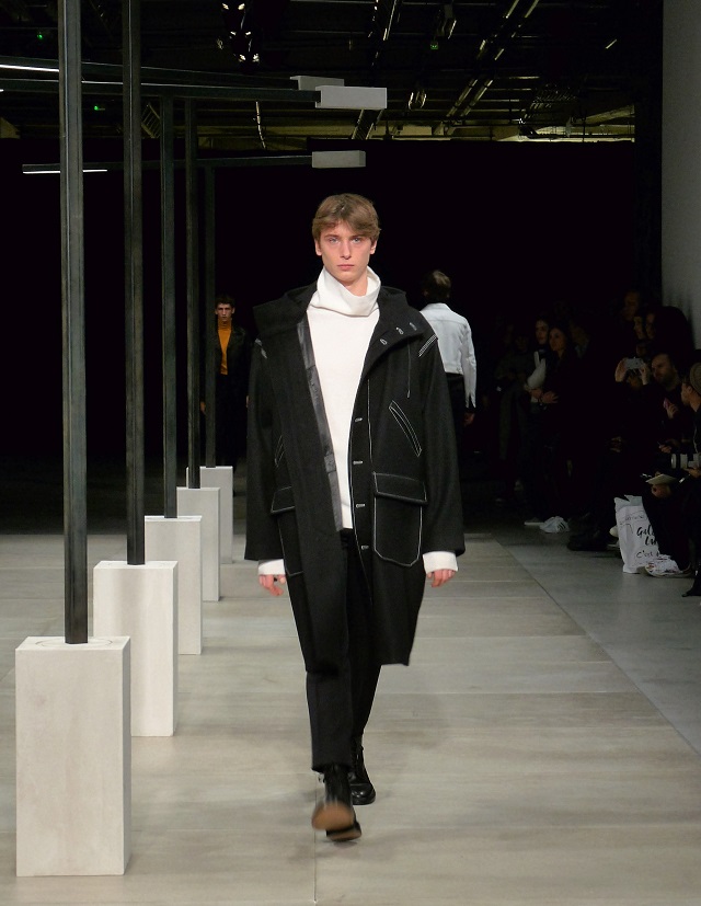
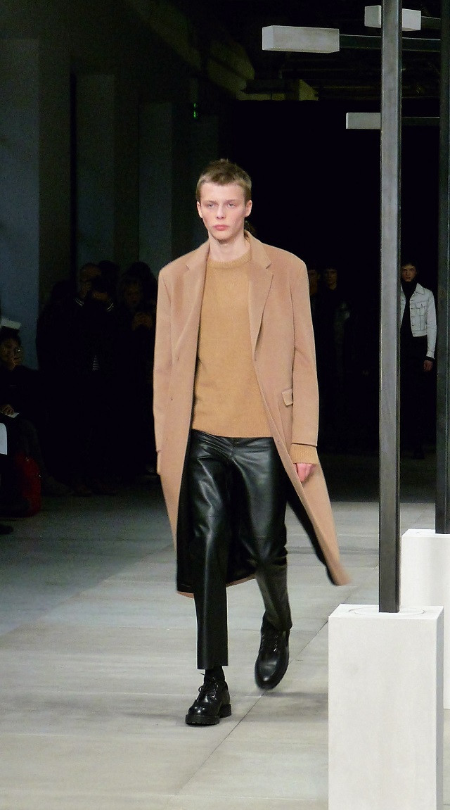
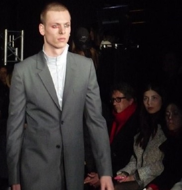
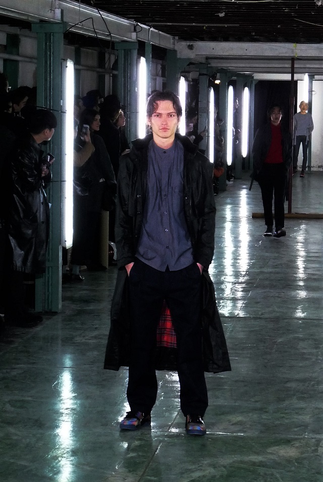
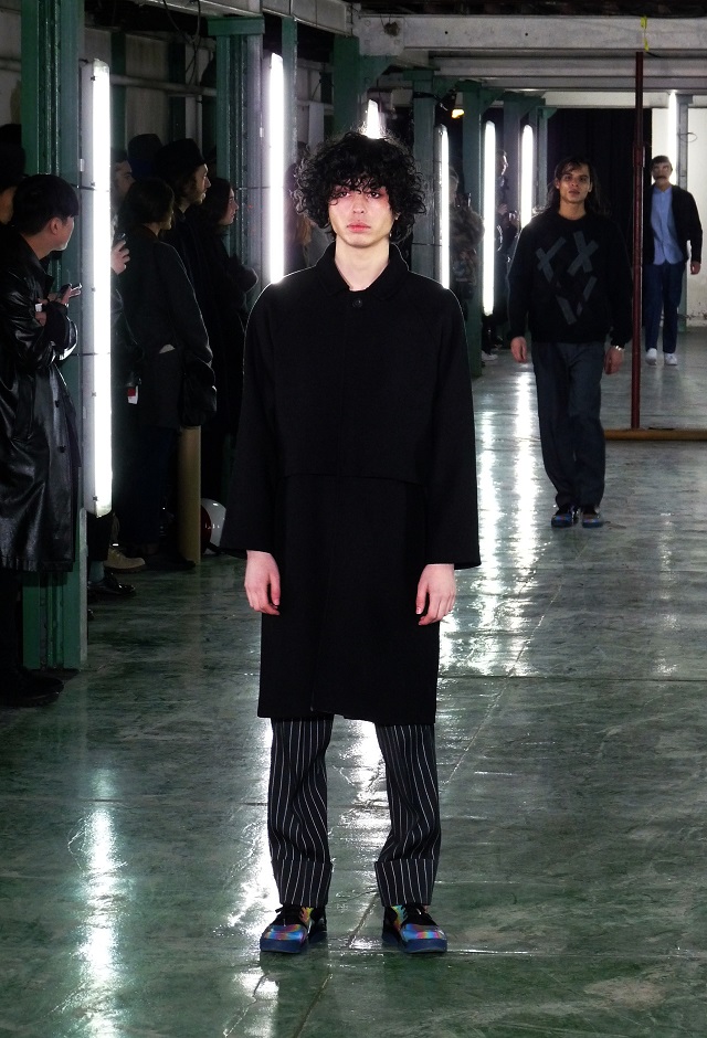
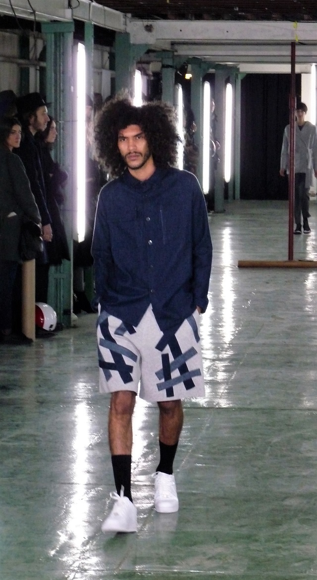
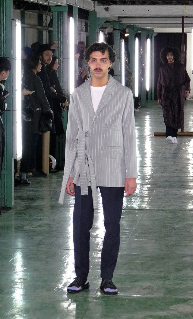
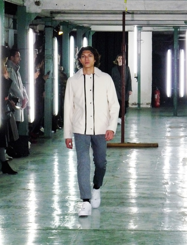
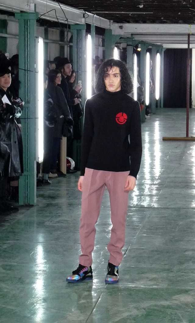
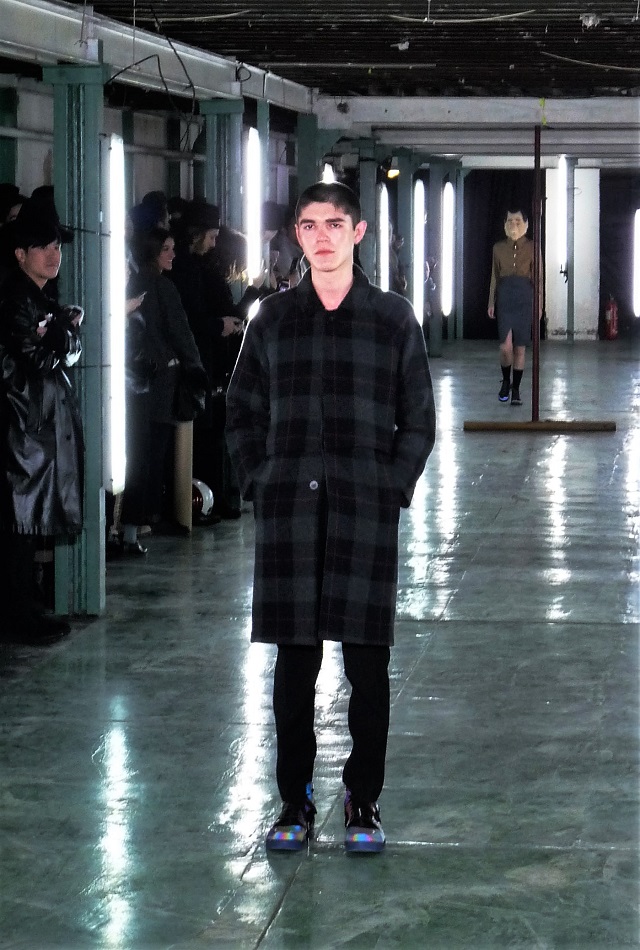
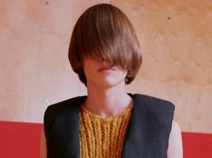
Some remarkable early-sixties-boy band coifs (the monkeys, the kinks, the rubettes, the beatles, the babes …) dressed in the minimalist creations of Jonny Johannsson creative director for ACNE Studios, whose theme (you guessed it) was partly based on the looks and uniforms of artists, partly on Swedish folklore (would love to hear the stories that go with the picture above), and a retro style of tailoring harking back to the forties. Sixties hairdos, forties style, minimalist impressions – the latter as is the rule in much of art and design coming from Scandinavia, all set in a tradition of Swedish folklore – as ACNE Studios of course comes from Sweden.

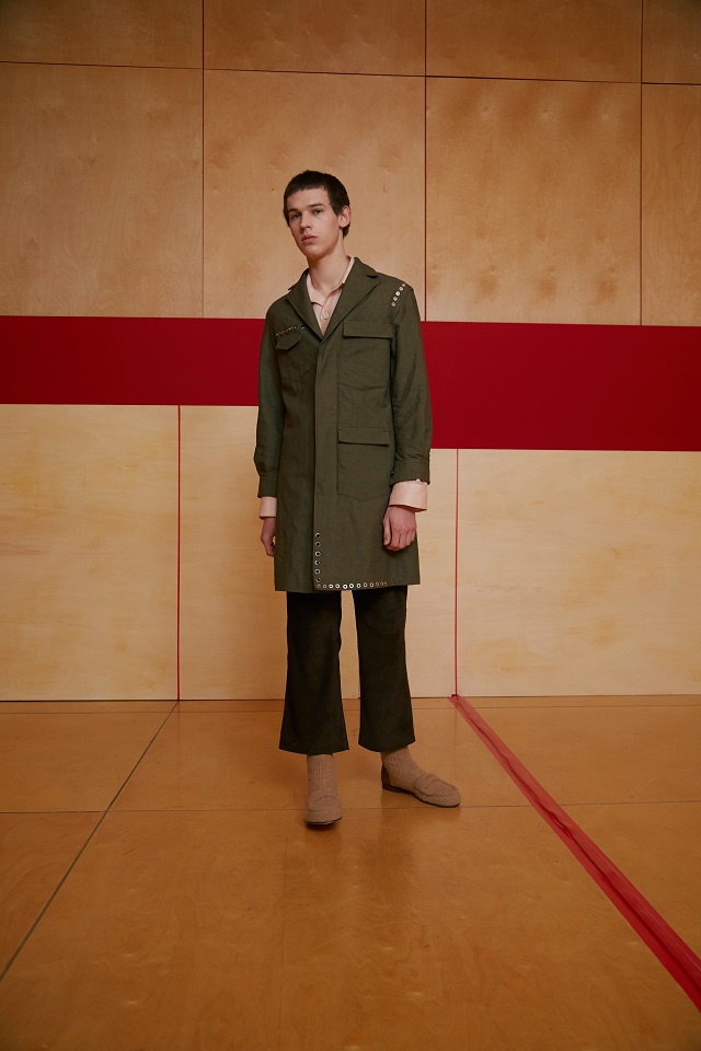
As a matter of fact, the press release is as precise and minimalist as the AW 16/17 ACNE Studios collection itself, and as we cannot express or describe it any better ourselves we leave you here for what it says to enjoy:

  • A neat and boxy double-breasted jacket like a pea coat
  • Workwear pants add to the air of functionality
  • An oversized donkey jacket with half kimono, half raglan sleeves
  • Tailoring is unstructured and unassuming
  • Woven wool coats with details inspired by Swedish folklore
  • Knitwear that flatters the body
  • Suede pants with cropped leg and tailored wool pants front pleated and tapered at the ankle
  • Colors are understated navy, grey and ivory – with flashes of lavender or pink
  • Voluminous organza shirts
  • Chunky socks are a must, as are felt slippers
  • Sneakers have extra tread, decorated for utility
acne-studios-1acne-studios-4acne-studios-7acne-studios-3acne-studios-5acne-studios-2acne-studiosacne-studios-8acne-studios-6


Posted by Sandro and photos from ACNE Studios press.
Many years ago there was this band called the Talking Heads who may have anticipated with their staccato music all the blabbering, chatting, cluttering, and clattering that is going on in our information age today, when during any given time during a day we are overloaded and bombarded with ever more and more information to the point that we are stretched to the breaking point – no longer knowing what to do, or where to go.

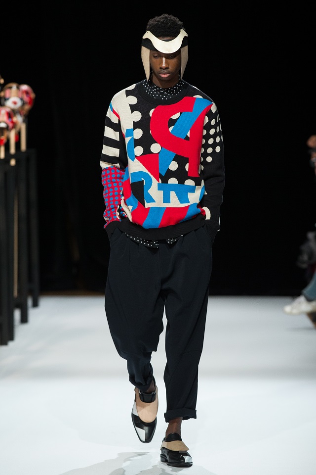
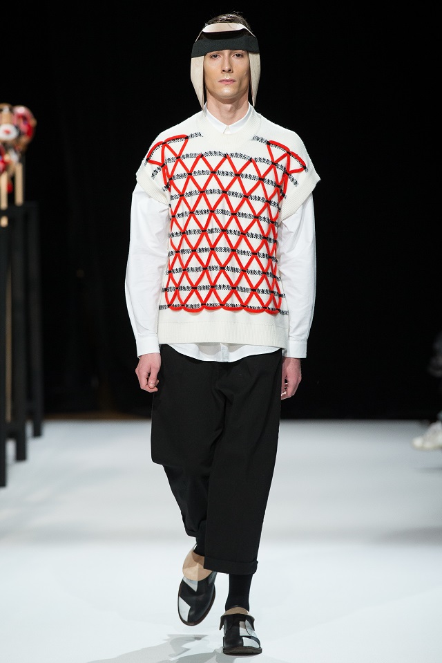
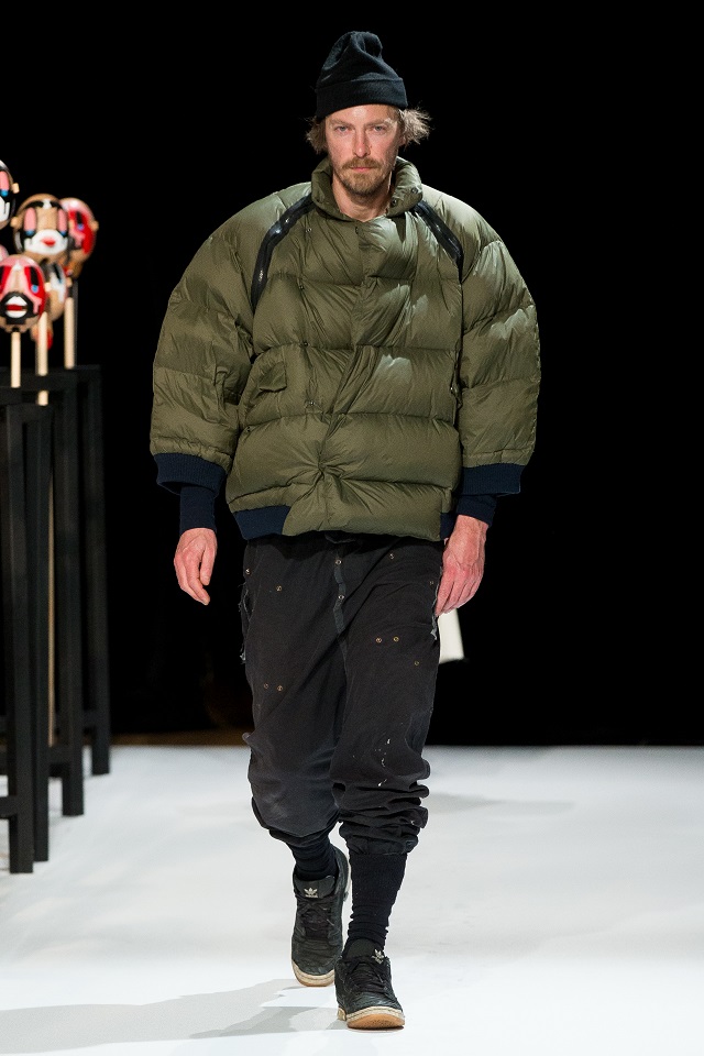
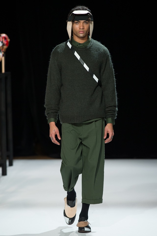
LK8 HENRIK VIBSKOV 17

The talking nutcracker heads of Henrik Vibskov. Photo by Monika Majewska.

So with information overload the theme of the runway show – and with the gaping mouths of giant nutcrackers rhythmically clacking on a steady beat – the models took to the floor with ear and forehead covers to protect them, and with a similar device on their shoes preventing them from not stepping or slipping up in the wrong way, and in the wrong fashion. For in this information age – every step, and every bit and bite, whether analogue or digital – has become a potential pitfall.

Backstage, a model with an ‘information overload protection device’)

Backstage, a model with an ‘information overload protection device’. Photo by Monika Majewska.

This show had a lot of character because of its very current theme but also because of its retro fashion offering in that both colors and design as well as patterns had been tied to old commercial labelling and packaging as well as to the well-known classic multiverse of jazz-posters so that an early fifties vibe was going to be very hard to be denied. Shoes and boots in simple checkered black and white against offprint coloring which only retro items can magically conjure. So yes, instantly classic we should say as a feeling of sheer envy creeps upon you as you watch telling you, “yes I want that sweater where do I buy it” so that you are left hanging with an involuntary memory that this show would be remembered – and remembered well for all the right things.

That those retro nutcrackers my crack open with their staccato jaws all the nuts of our spiteful information age so that the style and the colors of yore may be remembered forever more.  Or something like that. Courtesy Henrik Vibskov, designer, who had the courage, poise, and charisma to appear almost unnoticed as the last model on the runway (see if you can spot him in our slideshow).

lk19-henrik-vibskov-6lk15-henrik-vibskov-5lk30-henrik-vibskov-8lk27-henrik-vibskov-10lk7-henrik-vibskov-3lk23-henrik-vibskov-9lk20-henrik-vibskov-7lk11-henrik-vibskov-4lk1-henrik-vibskov-1lk2-henrik-vibskov-2


Posted by Sandro and photos from Henrik Vibskov press unless otherwise noted.

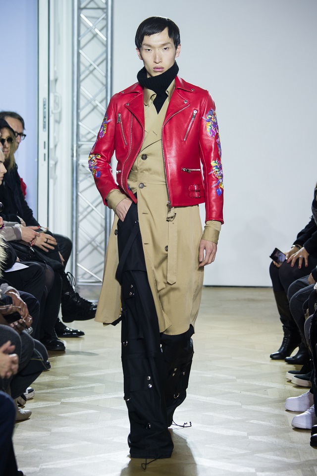
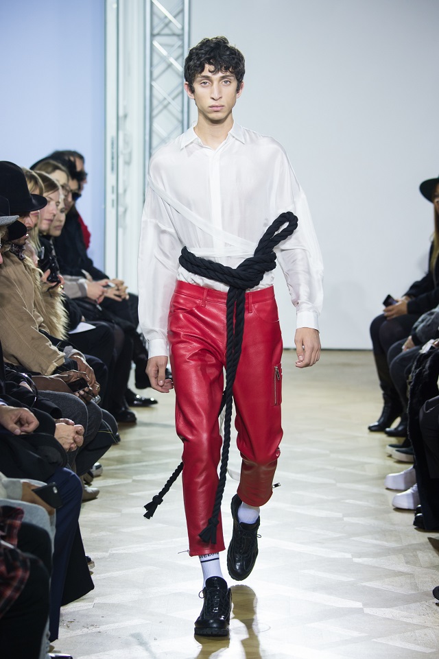
How to explain the Christian Dada AW 16/17 collection? Let’s start by saying that it is actually pretty grand, to which you can attest yourself when you see the pictures below. The venue for the runway was well chosen, a typical grand Parisian Hotel Prive as the backdrop – on the rue de Turenne no less, which is well known for all its men’s fashion boutiques. It’s in the heart of the traditional Parisian men’s tailoring district.

Dadaism being what it is, of course this collection had to be all about some form or type of deconstruction, where imperfections are highlighted in order to break taboos, to throw the classic and the traditional upside down in order to challenge the social contract that binds us all. So you would expect the end result to be something less traditional and more eclectic when it comes to fashion, and less beautiful – but surprise, surprise – it was not.

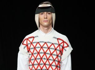
Young designer Masanori Morikawa from Japan had thus been instructed by Christian Dada to create something out of many different things, and sometimes it can be imperious what designers are capable of when actually put to the test. For by employing the following ratatouille and hodgepodge of sartorial devices all at the same time Masanori was able to create something rather unique, flaming, flagrant, aye even shocking, yet ultimately beautiful:

  • Traditional Japanese weaving techniques like Yokoburi and Yuzen
  • Multiple layerings of clothing
  • Digitalized jacquard, print, and embroidery
  • A bondage theme using ties, buckles, and ropes
  • And a visual element where the right is obverse from left and vice versa

The latter idea came from the designer being influenced by a famous Japanese photographer artist who can only see with one eye. In other words, what we can see on the right is never equal to what we see on the left as the photographer always looks through the lens with only one eye, an idea which the existence of a photographer with only one eye surely highlights. Right is never left and left is never right. The colors, shapes, and forms that we see through the left will never be the same as those to the right. So let’s make it easy on the eye and create a visual obverse from left to right and right to left in our fashion collection.

Dadaism? Sure, because it shows when you can see traditional class and style being deconstructed into a kaleidoscopic new mold for a new style and a new fashion, which, we have to admit, is rather beautiful in its scope, and a project in which Christian Dada with Masanori Morikawa has wonderfully well succeeded.

christian-dada-9christian-dada-6christian-dada-4christian-dada-3christian-dada-5christian-dada-2christian-dada-1christian-dada-8christian-dada-7christian-dada-10


Posted by Sandro and photos from the Christian Dada press.
A little background here: BDMOTP covered this show back in June last year and when the runway was interesting but under the burning sun in a glasshouse setting without any air-conditioning, so finding ourselves at the well-aired Palais de Tokyo was a grand improvement as far as location was concerned – not despite the rain outside, but because of it.

We had liked the summer show and had noticed the cross-over men / women profiles for the menswear but none of that this time around as, despite one or two women appearing on the runway, the looks and colors, were clearly masculine, as was the theme of the performance.

So the question for 22/4 at this show was what you get when you cross a German designer (Stephanie Hahn) and a German made brand, with shows and marketing in France, while using fabrics and techniques from Italy (alpaca /wool /viscose), while your memes and themes are all English?

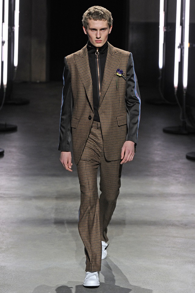
Because the patterns were tartan, Prince-of-Wales, and of course, hounds-tooth. Because the theme was based on the Hacienda club tracksuits from industrial Manchester in England during the nineties.  With a touch of English surrealism (Edward James). And with a touch Mexican colors. Just a slight touch. Because everything was really bloody green. English lawn green. Different shades of green and then some, every green on the spectrum except Hooker’s green (look it up): Olive, Teal, Mud, Pear, and Moss. Which kind of went very well with the copper zippers with the large rings which is more of a seventies invention. That copper and that Hunter green, was that not German? No, it was English but not not very urban. More abandoned-industrial-city-in-provincial-setting kind of style. Lots of zippers yes, and, aye, even trumpet sleeves. Those seem to be in vogue this fashion week in Paris, because we have seen them before time and again.
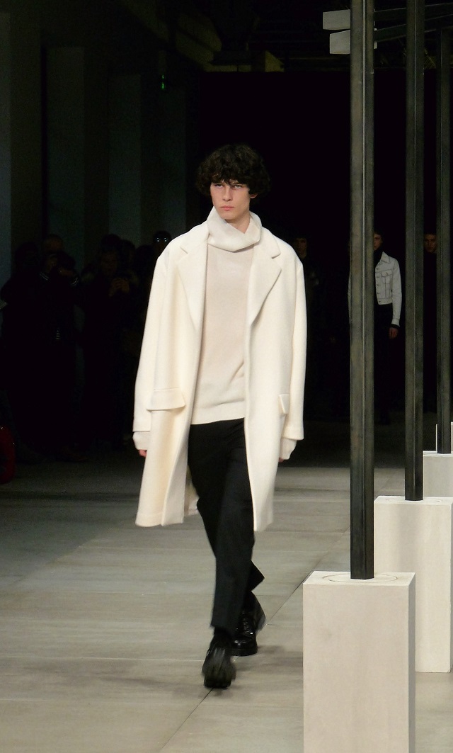
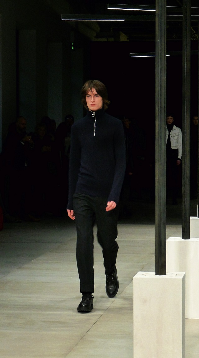
Now we will leave it at that but for to mention that despite the eclectic description given for the collection in the paragraph above that the work is actually very coherent and consistent and recognizable. The different elements combine to create one set of grand styles which forms a unit. That was the classy part.

But we like to question why so many designers are trying to give a deeper social meaning to their collections these days. Isn’t beauty and style on its own just fine? Why are so many designers trying to make some type of a statement? Because the press release mentions that the interesting and beautiful 22/4 collection is social wear. Back to the days of the Zoot suit I guess, where your style means something as to what you have to say about your beliefs. There is nothing wrong with it of course, but should designers try to force that on us?

Now of course fashion has always had that role – to express in style what you cannot say with words for fear of persecution of one’s beliefs. Yes. But if that becomes the ambition of every designer in the world then we’ll never see the end of it and we will have to start being afraid that what we buy to wear is being sold not just for being pretty and comfortable, but for the ideas that lie behind it. And that can never be the sole objective of fashion. Especially not with a collection as beautiful as the AW 16/17 of 22/4. Which comes in 50 shades of green.

22/4 Hommes Men's RTW Fall 201622/4 Hommes Men's RTW Fall 201622/4 Hommes Men's RTW Fall 201622/4 Hommes Men's RTW Fall 201622/4 Hommes Men's RTW Fall 201622/4 Hommes Men's RTW Fall 201622/4 Hommes Men's RTW Fall 201622/4 Hommes Men's RTW Fall 201622/4 Hommes Men's RTW Fall 201622/4 Hommes Men's RTW Fall 2016


Posted by Sandro and photos by 22/4.

We were happy to get an invite for the Sandro presentation this time in Paris as it is one of those ubiquitous brands in France in the high-end ready-to-wear menswear market that you really do not want to miss for their latest collection as there are so many other brands are trying to compete for men style haute gamme. Thus it is interesting and useful to be able to compare seeing and analyzing the items first hand. Kooples, Zadig & Voltaire, Façonnable come to mind amongst others as brands in France all in relentless competition for what is an ever more difficult upmarket in the times of global economic policies of ‘austerity’.

However whatever is so quintessentially French with Sandro’s style – sometimes called ‘contemporary French chic’ in America -, is probably the style which the French call BCBG (not to be confused with former NYC underground club CBGB), which literally stands for Bon Chic Bon Genre, a term of which a proper cultural understanding would probably defy many a sartorial fashion expert – or even logic, or Vogue, or Vice magazine for that matter.

For this you must understand that French society is rather stratified in its social hierarchies and that ‘bon chic’ is traditionally not something which is considered to apply to the popular masses – like street wear, but rather something super stylish and swag to which only the haute bourgeoisie – the upper class – could pertain. Now add to this the words ‘bon genre’ which could easily mean ‘a good social standing’, and one would end up with something like ‘good style, good standing (GSGS), which may in American English translate as ‘preppy’, but to make things confusing it is often true in France that ambiguities in language are rather the norm than the exception, so that in the end you are really never sure what something means after all. And so it stands with BCBG.

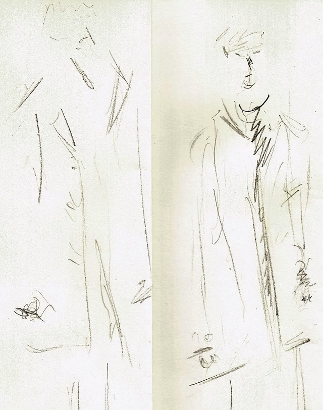
So to solve the ambiguity of what Sandro actually is – or should be, as far as style is concerned in English, BDMOTP has developed a fashion test for you here below.  Because going to a fashion presentation as was the case here (the models stand or walk and come back rather than run up and down) rather than a runway show allows for more time than normal to admire in detail design and signature in a collection, we were able to draw for you one specific item from the Sandro AW 16/17 collection. Voilà!

Sandro 1

Sandro by Sandro for BDMOTP

And thus this being Paris – the cradle of artistic experience and the home of Picasso and Toulouse-Lautrec, we would like to know from you if you have a fashion-trained eye, and if you can identify and distinguish CHIC when you see it.  Here is your test.

  • identify which item from the Sandro AW16/17 collection in the slideshow below (from the five pictures, chose one) is represented by the two drawings above (3 points)
  • think of a good and proper name for the style you have just identified in English (3 points)
  • give three reasons as to why the style you chose is or is not BCBG (3 points)
  • and finally, – is this CHIC? (bonus)

What is chic?

Please leave your comments below.

sandro-3sandro-4sandro-2sandro-5sandro-7sandro-6


Post and Art by Sandro for BDMOTP and photos by Monika Majewska

Le Gibus is by far the darkest, dankest, and grimmest underground club in Paris, but each fashion week it is nevertheless of course happily used as the setting for some kind of men’s fashion show.  Which means that when you cram in there (low ceilings hanging loose and no lights) eventually you feel like a pack of rats stuffed and hiding somewhere between the street stones of a forgotten gutter, which is the natural ambiance that Y Project wants to create no doubt, but which worked to the detriment of our photographer who was having some difficulty getting in the right angles and the right shots while being compressed in a crowded, dark and claustrophobic space.

You would thus think that such a show would only give you Berlin or Amsterdam type of street wear, because that is what dark underground setting usually do when they are accompanied by techno and drum & base, but lo and behold, appearances do deceive, and your eyes are not lying, because here is quite a classic picture worthy of framing taken by our photographer when one talks about:

“For the best dressed man on the planet, and the ladies who adore them.”

As this is the old motto of BDMOTP.

The best dressed man on the planet and the ladies who adore him?

The best dressed man on the planet and the ladies who adore him?

BDMOTP will therefore forgive the Y Project and also the horrible Gibus and get on with explaining the show.  For somehow, let’s say that only the French could pull this off: To have the ability to combine real CHIC with some real heavy duty UNDERGROUND streetwear.

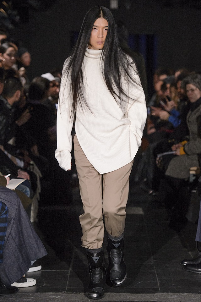
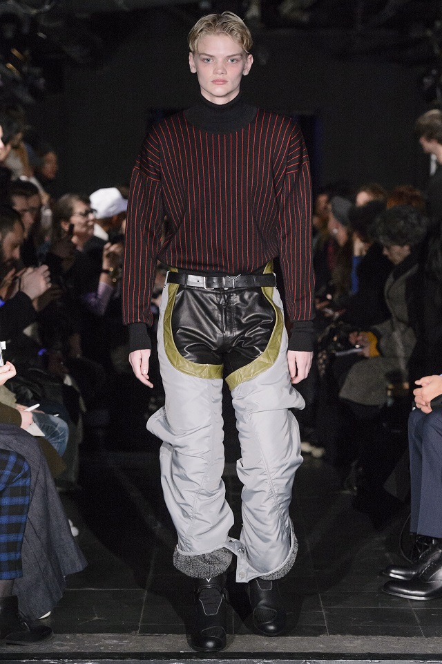
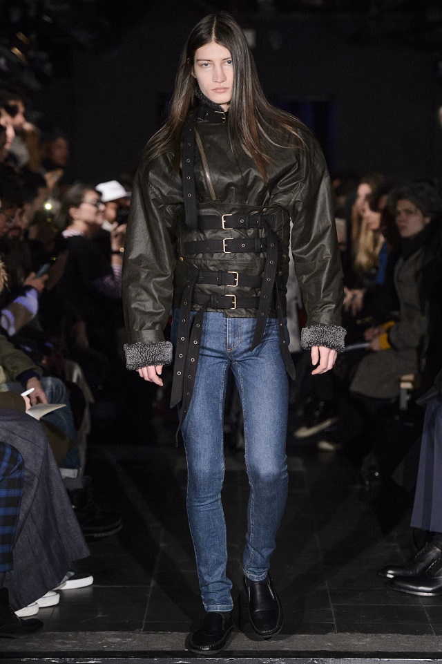
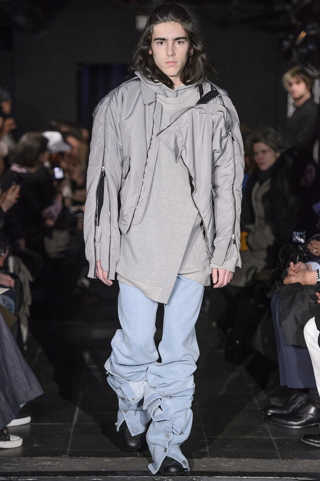
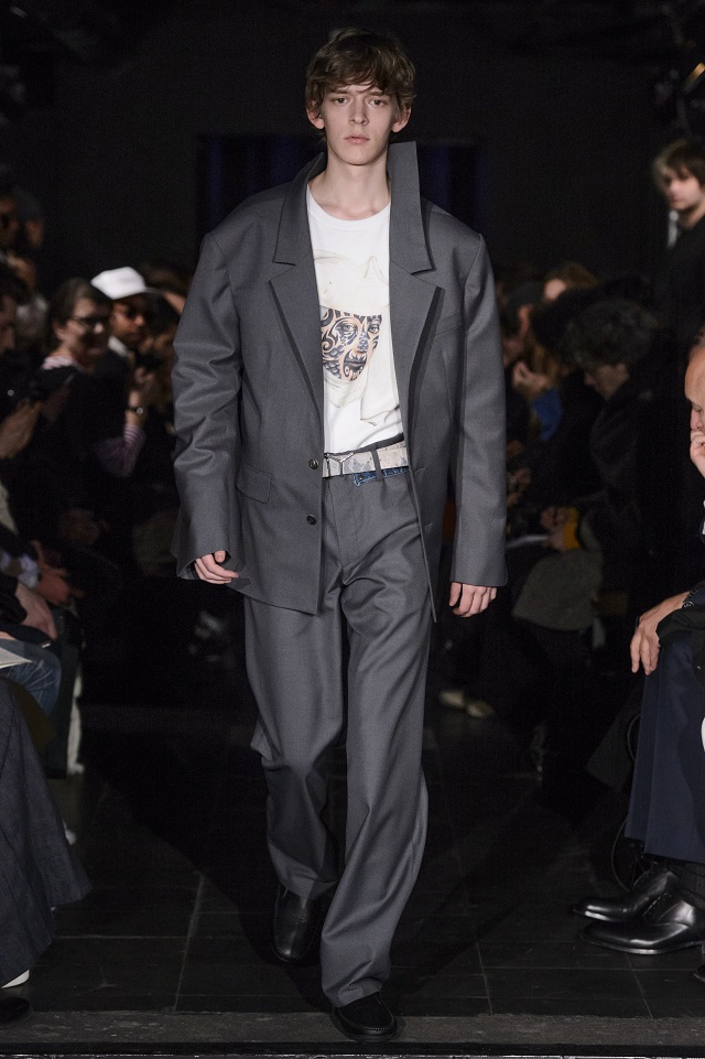
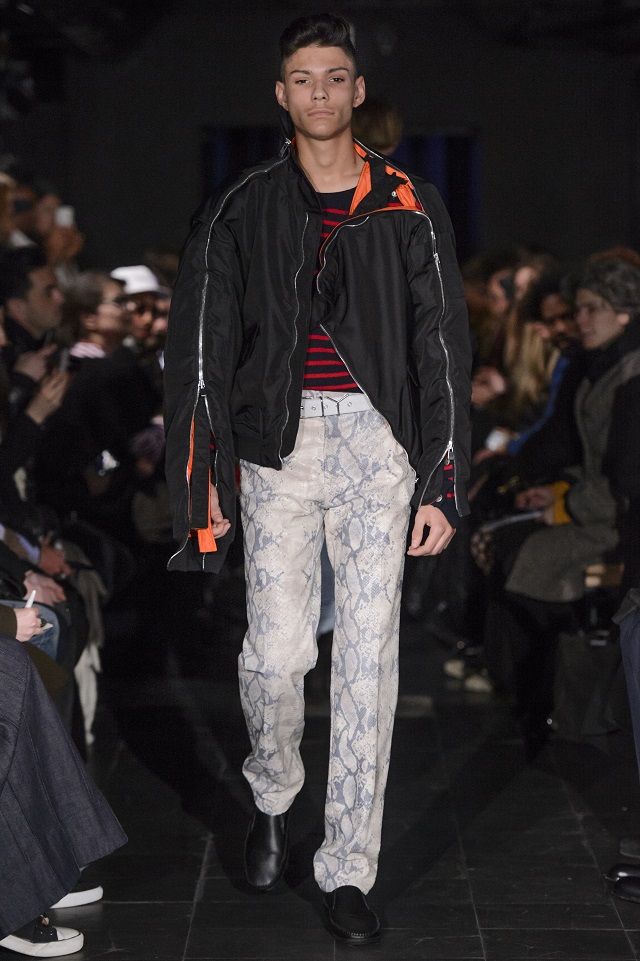
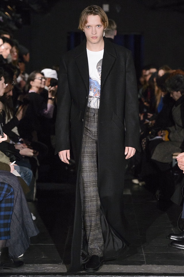
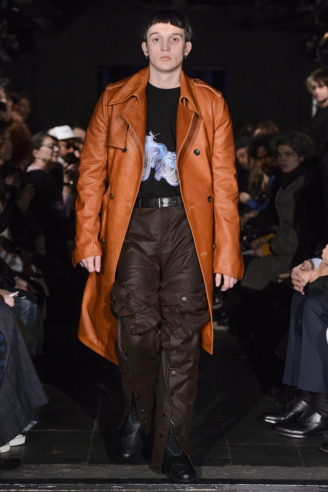
Indeed the Y Project collection is now going into its fifth year and still runs under direction of creative director Glenn Martens, who harks from Bruges, Belgium, and who has worked for Jean Paul Gaultier in the past. Yet Y Project essentially is a French brand and that is probably why there is this knowhow to combine chic & class with industrial, with base, with techno, and with underground – so that we can dub this menswear collection perhaps as Dark Urban Undergound Chic, and when you finally read in the press release that one of the inspirations for the show was the old dark urban underground flick called Trainspotting from 1996, then the image of urban squalor and desolation (the movie is set in the ghettos of Edinburgh), and there with the signature style of the project, will have become complete. With the added French twist that all the bad stuff that is supposed to happen, is also naturally CHIC. And that’s class.

KEY PIECES (as listed by the press release) in the collection AW17 are:

  • Washed and frayed Denim pullovers and trousers
  • Multi-zip bombers
  • Shearling patchwork jackets
  • Oiled cotton bondage jackets
  • Harris Tweed trench coats and bustier dresses
  • Snake-skin print hoodies and pants
  • Nylon shearling-lined chaps
y-project-redux-5y-project-redux-8y-project-redux-6y-project-redux-3y-project-redux-10y-project-redux-2y-project-redux-1y-project-redux-9y-project-redux-7y-project-redux-4


Posted  by Sandro and photo Icon by Monika Majewska/other photos from Y Project.

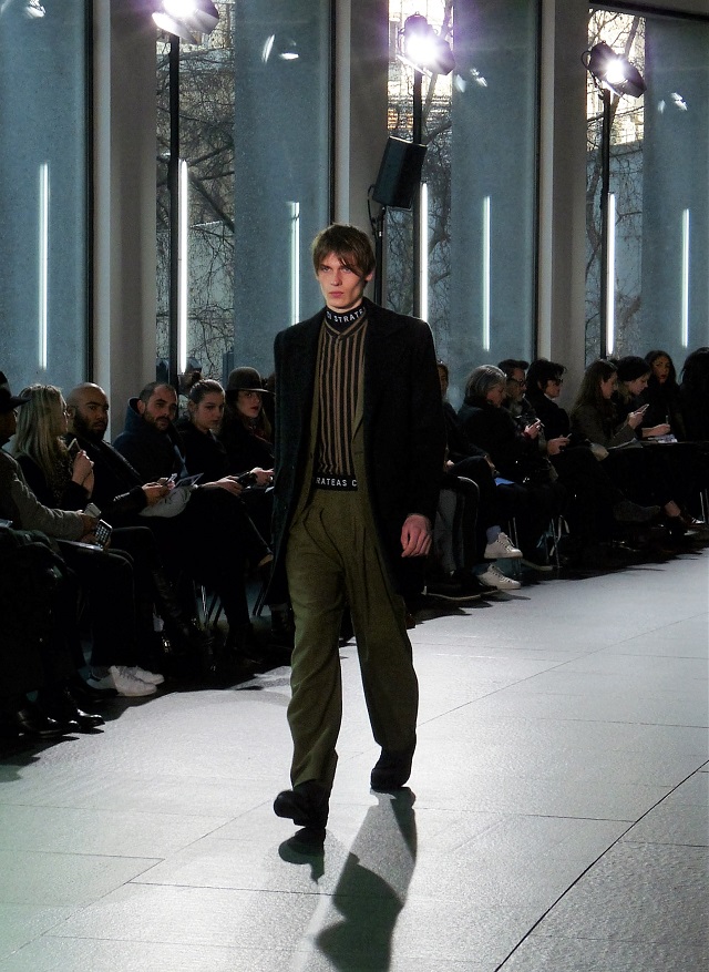
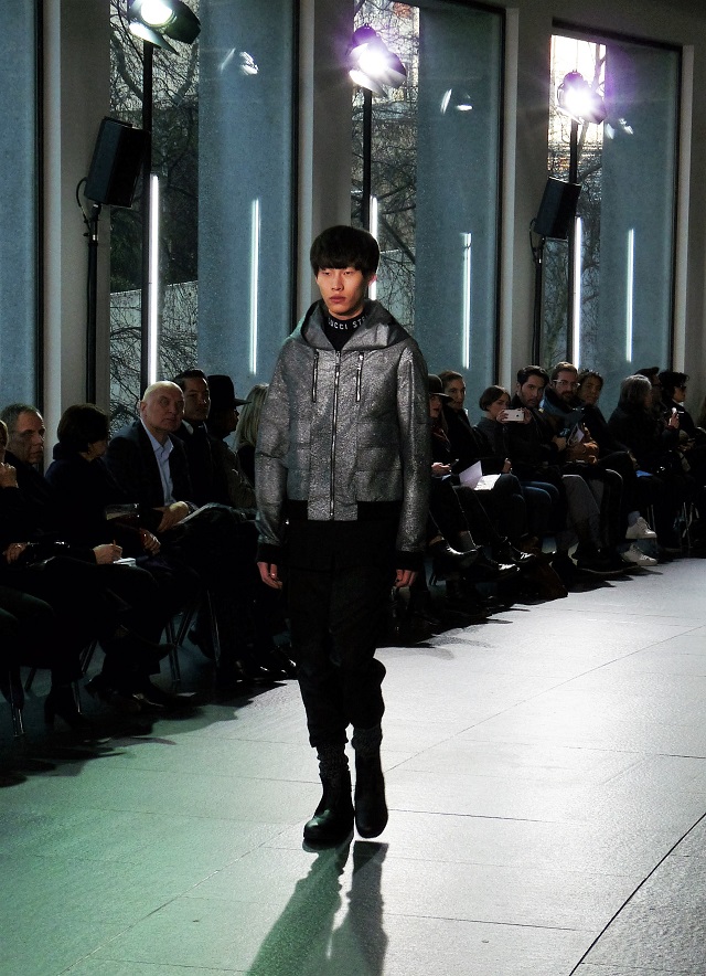
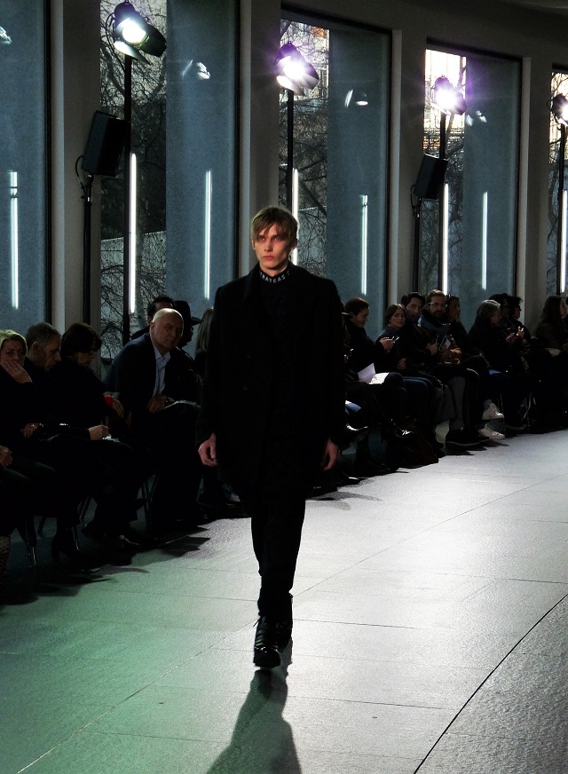
As the Australian embassy sits smack 10 stories high next to the Eiffel tower this made for an interesting backdrop for a runway with a view, the works of Harry Seidler’s living monument of grand urban architecture (the embassy) nicely displayed on one end, the male models in their high-end luxury Australian wool-works parading in a converse towards the reflection of the other.

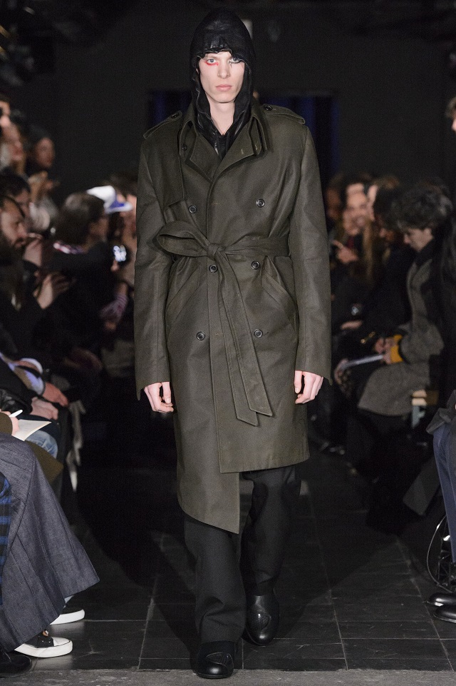
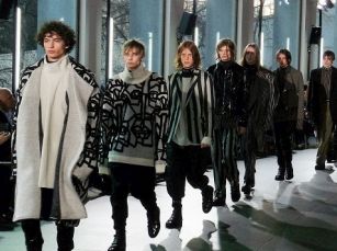
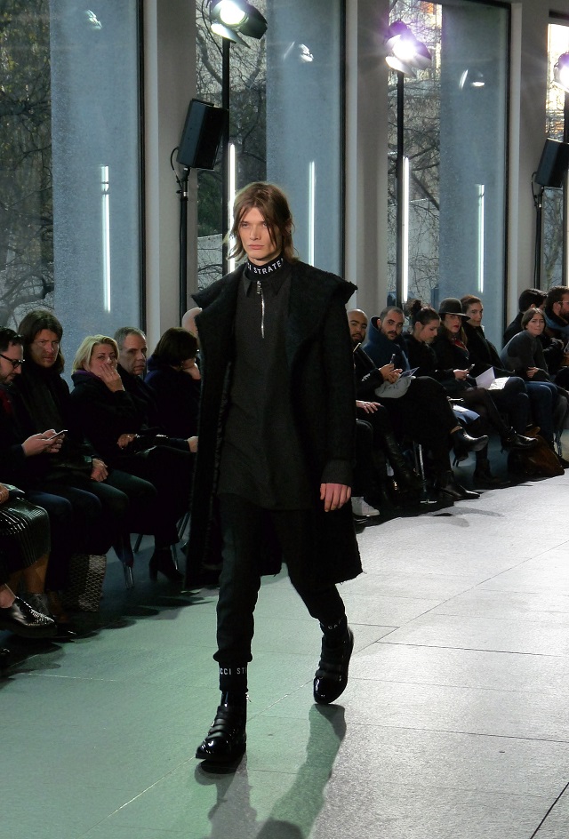
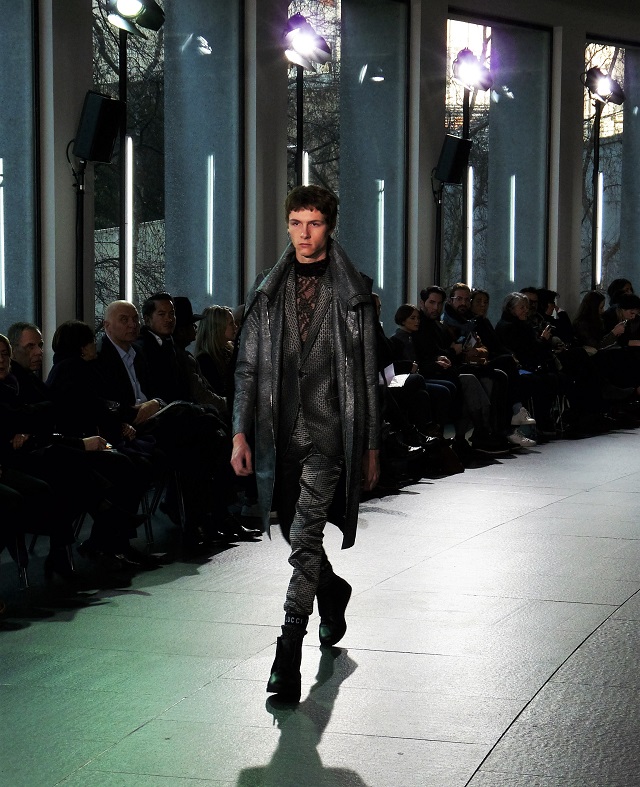
Strateas C. Caption

For after all, the Strateas Carlucci connection with the Australian Woolmark company is no coincidence and seems to be a perfect fit (no puns intended) as the team of Australian designers loves to work with wool as an innovative tool of sartorial luxury development. It cannot be a coincidence therefore that this highly awarded team of designers (Peter S. and Mario – Luca C.) has been covered over the past couple of years by many important magazines and publications in the fashion industry, so that now at last they have been invited by the ever-so-notoriously-hard-to-please French Chambre Syndicale de la Couture as the first Australian menswear collections to be officially represented on the calendar of Paris FW Homme.

And that is it in a nutshell, but mind you, that this elegant collection has been put together in full cooperation and partnership by the designers with the famous Woolmark – a well-known company and brand, of course, yes – but a company under the auspices of a non-for-profit organization called the Australian Wool Innovation, which brings together more than 24,000 different Australian wool growers all under one roof:  A beautiful cooperation where art meets industry and industry meets art & métier in the traditional fashion of the word.

This organization ever so elegantly states that wool is:

‘The world’s most luxurious and fashionable fiber’ and, ‘the ultimate natural fiber and premium ingredient in luxury apparel’.

Which is very true, and which, if you get to see it up close in the Strateas Carlucci collection on the runway for AW 16/17 – handmade by designers at the top of their game and skill, perhaps becomes the measuring stick by which all other Merino wool apparel should be judged hence on.

So maybe the Chambre Syndicale is onto something after all (as they so often are in their incomprehensible and mysterious ways).

strateas-c-6strateas-c-1strateas-c-3strateas-c-5strateas-c-4strateas-c-7strateas-c-2


Posted by Sandro and photos by Monika Majewska.

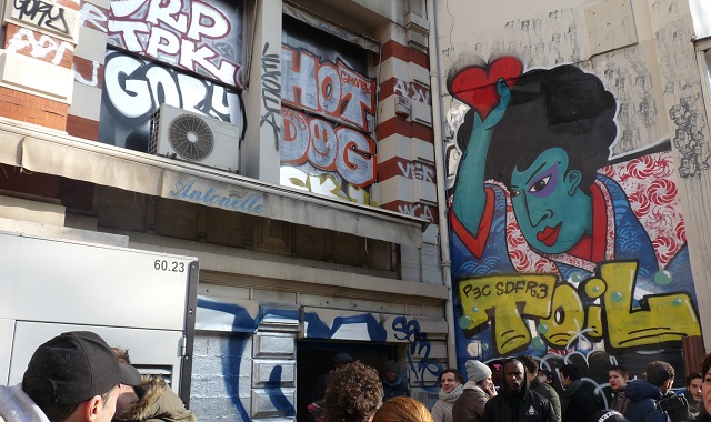
Paris fashion week HOMME fittingly kicked off with AVOC on a cold and crisp and sunny Wednesday morning in the Canal St Martin area not far from place de la République in the same general area where just two months earlier in November the attacks on Paris had taken place, so it was very nice to see a large crowd of fashion loving people out in force and on the streets all trying to cram and jam into a small underground portal of a derelict and abandoned building vandalized happily by graffiti artists, where, hiding in its bosom an industrial silver metal-neon runway had been built as if it were a re-construction site for an interior falling apart out of neglect of maintenance over the years – which probably it was.
Because the show must go on.

Crowds outside an abandoned building in sunny & cold Paris, district Canal St Martin, electrical generator included

Crowds outside an abandoned building in sunny & cold Paris, district Canal St Martin, electrical generator included

Now AVOC offers a hearty style concept for those of you not faint of heart and daring enough to wade into the architectural undertones of this fashion of the streets, so it appears that the drum & base environment (VJ as part of the show, something you see a lot in Amsterdam during fashion week) in a construction setting must have been deliberately chosen.

But no worries because the end result of this clothing line is actually quite classy if you think it all may be a little bit too complex (see slideshow below), but for those who are really interested in understanding what is behind it all in concept and design we refer to the article we wrote on AVOC some time ago which will explain to you in detail what is going with this particular brand – it is quite interesting after all.

But suffice to say that what you see on the runway always comes out differently than what you expect had you known it in person first and beforehand.  Just compare this article to the last one we wrote.

avoc-viavoc-iavoc-iiiavoc-ivavoc-iiavoc-vavoc-vii


Posted by Sandro and photos by Monika Majewska.


Every once in a while we come across a new fashion concept so revolutionary that we think that it must have been around from the very beginning of fashion time. Surprise, surprise then when BDMOTP was browsing recently at fashion school annual showroom exhibition in Paris when we met a Hungarian young designer who had the foresight to come up with something what apparently has never been done before:  To create an ageless clothing line and collection for men over sixty – and simply call it – Grandpa.

Photo courtesy of designer.

Photo courtesy of the designer.

Hey, with all the thousands of super cool and hot pictures of hip and young-looking adolescent, twenty-something, thirty-something, and middle-aged men spotting the latest greatest accessories while donning the best and brightest new menswear designers flowing in stream upon information stream around the various media portals around the globe daily (yes we provide that type of content) – why not have a simple yet special collection for men over sixty?  Someone had to do it.  And in this case the creative designing artist is called Annamari Nagy, who is from Hungary and who is graduating from fashion school in Paris.

Grandpa X

One of the secrets for ageless over sixties is to use basic dark blue as a color – not to hide the wrinkles of course, but probably to accentuate them and make them stand out; and is to use basic denim and simple jacquard in minimalist fashion – again to make that age come out and not hide it; and is also to choose intelligently an appropriate collection theme or concept – which in this case is the universal and commonly known profession of ‘the butcher’.  Now imagine ageless men over sixty posing as butchers. In simple dark clothes with raw textures. It is a marvelous and grand idea – a concept long overdue.  So bring in Gerard Depardieu who must be getting up there now in age, and who is probably dying to try this collection on, as being a butcher has always been his dream.

Grandpa IV

Butcher’s garb for ageless men

Much of the work that Annamari Nagy is doing for this SS16 collection comes in the form of crocheting and hand knitting – a dying art perhaps – but indeed quite formidable and appropriate when attempting to match & mingle the pedigree of good ancestry with men of good old vintage and age, who like soft-ripened cheese, or good old wine, or better yet still – old whiskey or cognac branded only by the number of the oak barrel, still go forth in search of more, and who do not hold back, so that when your last cigar is smoked, and your last meat has been butchered, you will find yourself where once only old soldiers were privileged to go: they do not die, but fade away…

Grandpa V

Grandpa, for ageless men!

Posted by Sandro and photos by Mous unless otherwise specified.

DALEI Paris is a ready-to-wear brand by young designer Ahmed el Dalei, who in the past has worked with Yves Salomon Homme, as well as with stylist Udo Edling. Ahmed is inspired by an eclectic variety of sources and inspirations from around the world while his roots lie in Egypt. He sees himself as a world-traveler who brings different cultures, traditions, and superstitions out into clothing design. The current collection SS16 that BDMOTP witnessed in Paris last month was specifically based and inspired upon the hidden treasures and oracles of the hidden secret societies in the western world from the 1920’s. Since all hermetic thought and action eventually dates back to ancient Egypt, for the treatment of the occult arts as they would appear in clothing design, we could not imagine a better interpreter than Ahmed as a designer inspired by the mystic arts for this current day and age. And the looks and style he creates are therefore truly remarkable – and aye, even futuristic.

Dalei I

There is a strange urban dark chic to Ahmed’s creations and many pieces feature the long wear djellaba look that we know well from the middle-east. But if you then mix those items with mesh and other rare materials in exotic colors, forms and shapes, all of a sudden the style becomes very futuristic – as if you are walking onto the latest set of a Star Wars movie, build up for the deserts of some galaxy far, far away.

Princess Leia by DALEI

Princess Leia by DALEI. Photo by Mous.

Urban street wear or sporty casual chic?  Maybe, but this mysterious collection inspired by old secret societies could easily go further than that. It has the whiff of a clothing collection fit for ancient dance rituals engaged in to bring mummies back to life – or perhaps to guarantee someone a safe passage to the hereafter after they have departed. And in this way strangely the style of the far future beckons and seduces us as much as the style of the distant past. And that is as odd and mysterious as the design was probably meant to incorporate. A mystery of sorts. A conundrum which could not be explained – not even by a Sphinx.

Some of the mysterious inspirations of DALEI

Some of the mysterious inspirations of DALEI. Photo by Mous.

On a final note we must say we loved the DALEI collection very much. And that we believe that Ahmed will go very far with this if he keeps on tapping into the various superstitions and sub-cultures of the other side as a source of inspiration in clothing design. For who does not love – or has a secret fear of – the world of hidden rituals and dreams long gone eons ago – or those of eons hence to come? When deep underneath the deserts sands death is only the beginning!

dalei-vidalei-iiidalei-ivdalei-vdalei-vii


Posted by Sandro and photos by designer except those by Mous where credited.

Page 8 of 14« First...678910...Last »